ITC Course Registration
Reframing the course election experience to foster delight and academic fulfillment
Time
Team
Role
Deliverable
10 Weeks
1 Project Manager
Research
Design System
Figma Prototype
UX
Visual
4 Product Designers

We re-imagined Dartmouth College’s course election experience by designing a web interface that guides students in making more informed decisions.
This was a project at the DALI Lab for our client, the Dartmouth Information Technology and Consulting (ITC) Office. As one of the product designers, I spearheaded the user research synthesis and analysis, the “Bookmarked” section, and the user testing guide. The other product designers and I collaborated as a team on the user interviews, the style guide, the “Search” page, and prototyping, among other features.
BACKGROUND
PROBLEM
OPPORTUNITY
Currently, Dartmouth students feel irritated by the lengthy and confusing course election process, making the experience dreaded. They feel not only that the interface is outdated and does not meet their technological needs but also that the election process is obscure and unfair.
Overwhelmed Dartmouth students need to engage with a more intuitive and informative course election platform in order to feel more satisfied and fulfilled by the lengthy process.
How might we simplify the three-pronged course registration experience while also fostering delight and academic fulfillment?
Every quarter, Dartmouth students face the long, stressful struggle of electing and registering for courses, citing anxiety and disappointment as a result. The process includes three sections:
The election period
After careful planning and extensive research, students elect three courses that they want to take in the following quarter.
The registration period
Students review the classes they have gotten into.
The adjustment period (also known as the add/drop period)
Students add new classes or “drop” current ones before the quarter begins. This process repeats during the first two weeks of that term.
SOLUTION
The Dartmouth Course Election and Registration Process
a web interface that simplifies the three-pronged process, guides students towards fulfilling decisions, and nurtures their academic curiosity
Promotes organization
When first accessing the interface, all students land on the dashboard page. This page contains all the courses for which they are registered, a calendar view of their class schedule, and additional details for each of those classes.

Encourages in-depth course searching
When electing and registering for courses, students are now able to directly search for classes (unlike before). They may also use and combine different filters, ranging from academic departments to time slots or distribute requirements.

Increases registration chances and decreases user load
Rather than electing only three courses, students now have the option to elect up to six courses. This feature encourages students to plan ahead and decreases the user load during the adjustment period (also decreasing the chances of the website crashing).

Invites structure and planning
By allowing students to bookmark and categorize specific courses, the website provides a “big picture” view of students’ academic future. They can use this function to plan for their major or to keep in mind interesting courses!

check out the process
The Dartmouth Course Election and Registration Process
Reframing the course election experience to foster delight and academic fulfillment
Research
Define
Test
Reflect
Ideate
Prototype
Industry research
User interviews
HMWs
Flow sketches
Feature prioritization
Low fidelity wireframes
Visual design system
High fidelity prototype
Usability testing
Revisions
Next steps
Key takeaways
Empathy maps
User personas
POV statements
PROCESS
RESEARCH
Industry Research
We began by reviewing and critiquing Dartmouth’s existing course election platform, noting what features seemed successful and which seemed unnecessary or confusing.
We then conducted some industry research by analyzing the course election websites of other colleges as well as websites with other interfaces.
We became inspired by the left-hand menu bar and the dashboard feature.
In terms of the interface, we decided to keep the clean, simple aesthetic and the columns for displaying courses.
Lacks important information, such as time slots
Lots of irrelevant and confusing information
“CRNs”
Course type
Total credit hours and billing hours
A lot of the acronyms are not explained
Call To Action buttons are too small
Current Course Election Page
Likes
Dislikes
Has a confirmation pop-up for dropping courses
Displays course code and title
Current Course Search Page
Likes
Dislikes
Time slot codes are hyperlinked to the course timetable
Columns are a good way of organizing
No ability to search for anything
No information on class prerequisites
Page is overwhelming (too much information)
Text size is too small
Learning objectives are unnecessary
The acronyms are confusing
No ability to combine certain filters

RESEARCH
User Interviews
To gather deeper insights, we conducted ten in-depth user interviews with both graduate and undergraduate students at Dartmouth.
Our questions sought to understand student experiences with the whole course election process and the existing course election platform.
User Interview Questions
Could you walk me through a typical experience of you electing courses?
What do you find challenging or annoying about this?
What feature(s) do you find most useful?
What do you focus on the most when registering for courses?
What could make the course registration process better?
“
The website feels like it was made in 2007 and hasn’t changed since then.”
“
I want to craft a story with the classes I am taking.”
“
There doesn’t seem to be any reason why one person gets into a class and another doesn’t.”
“
It’s a bit obscure and confusing using the website.”
We identified many memorable quotes:
DEFINE
Empathy Maps
Based on our user interviews, we created empathy maps to further understand our users’ most latent needs.
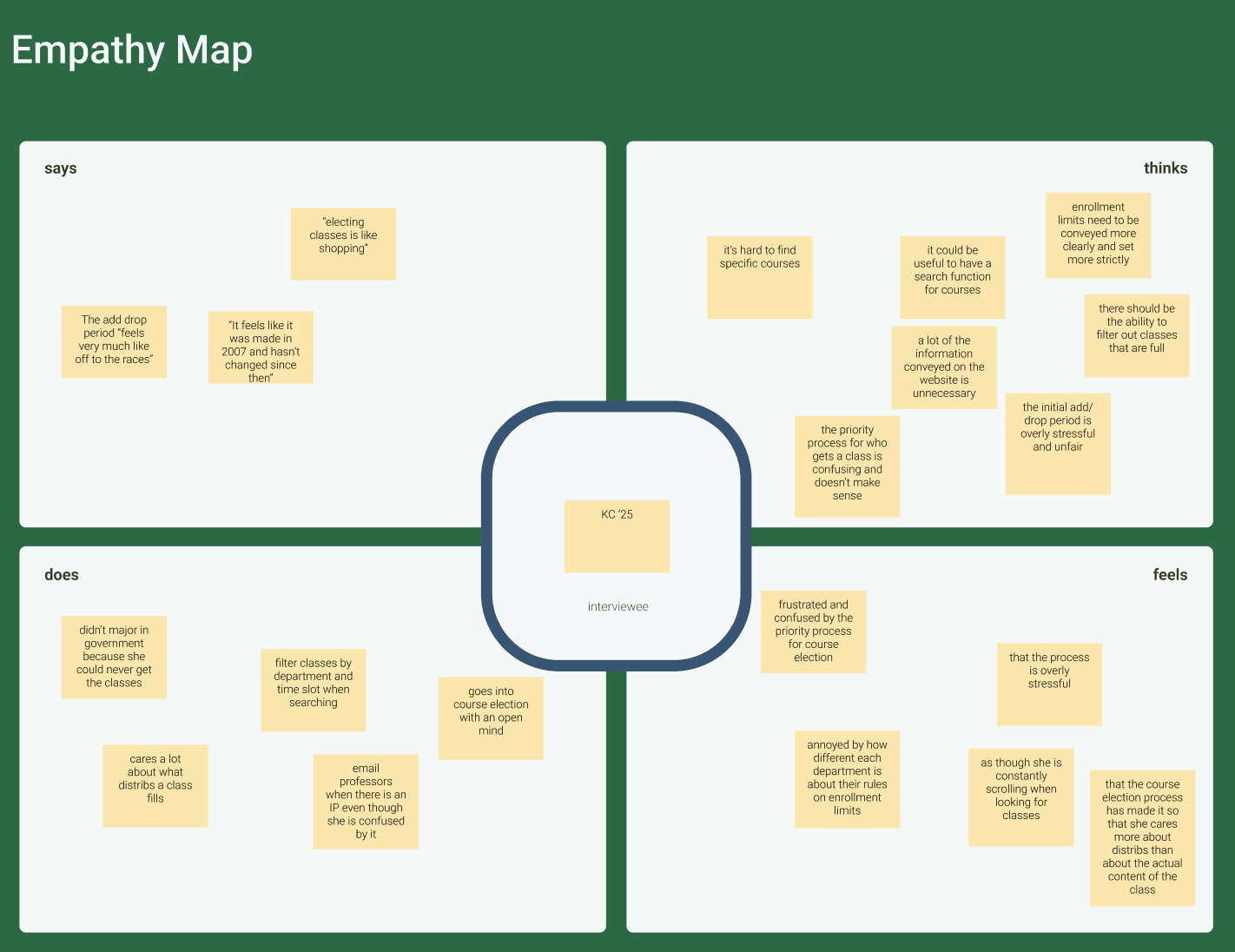
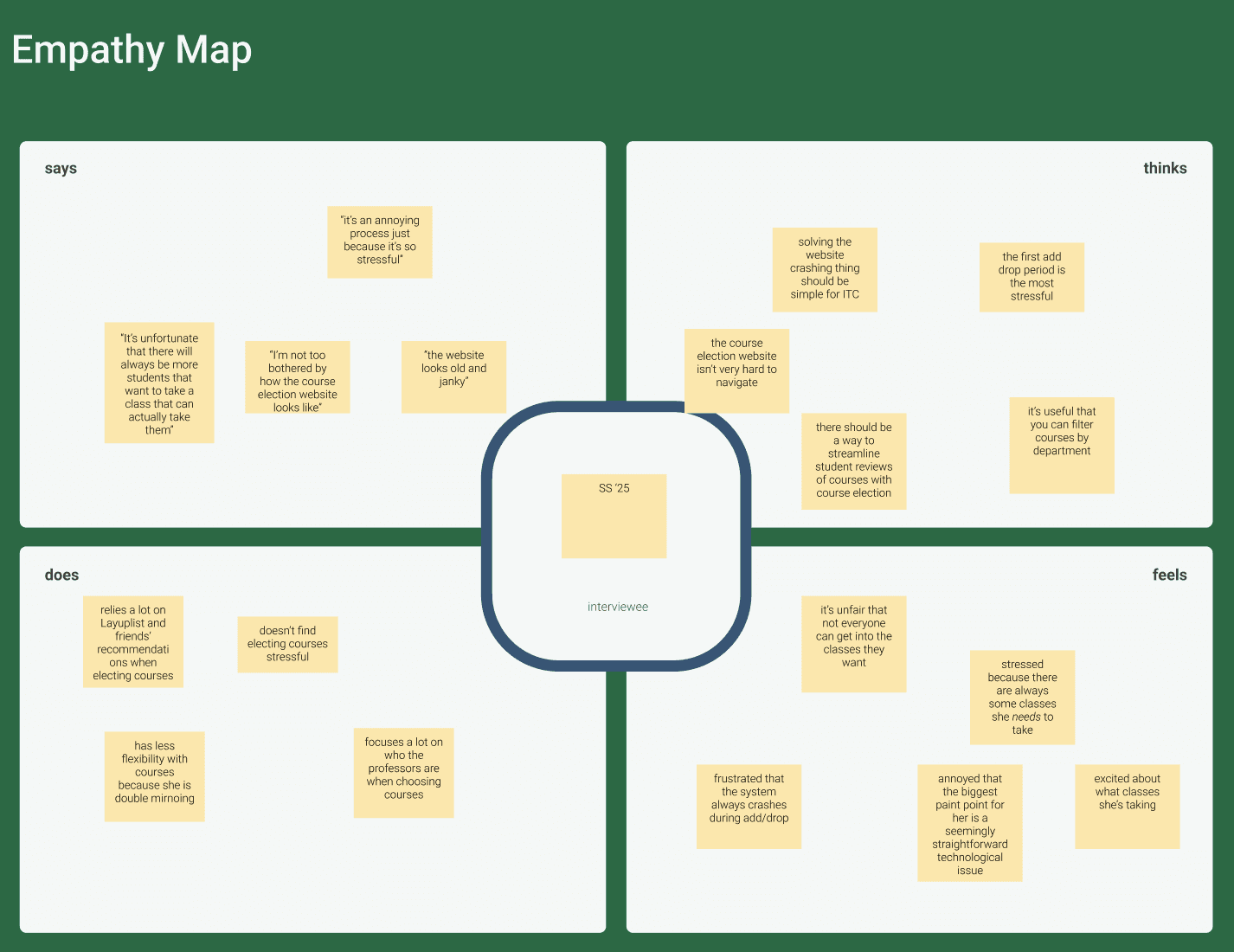
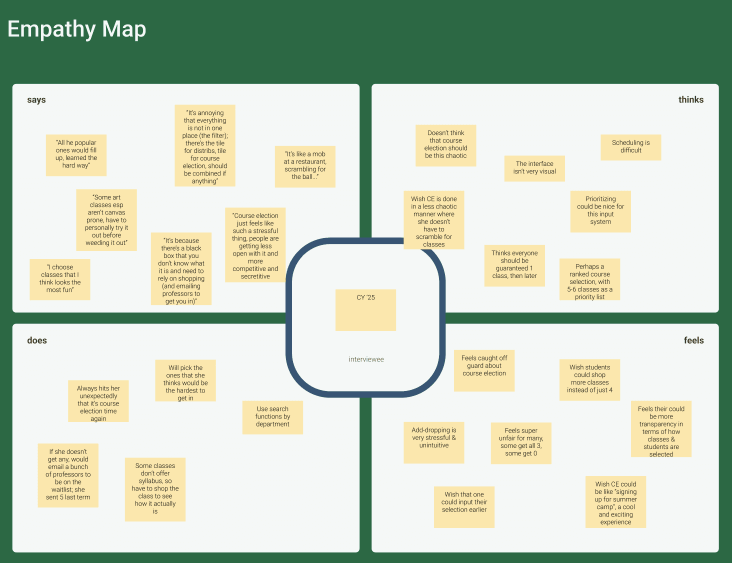
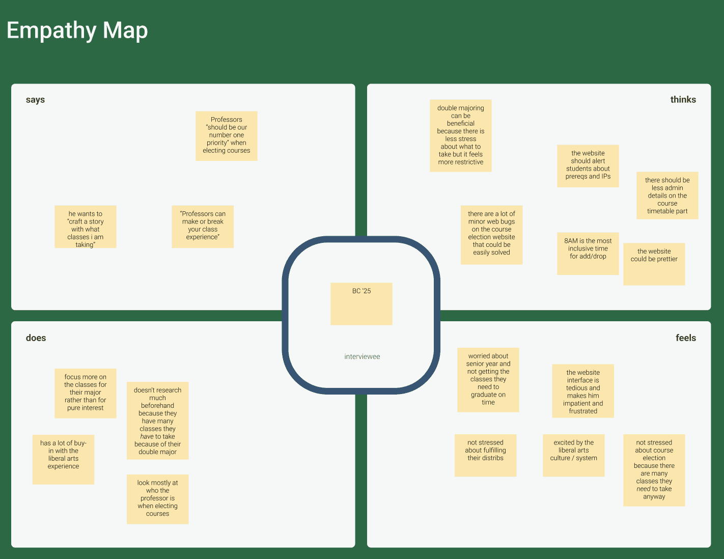
DEFINE
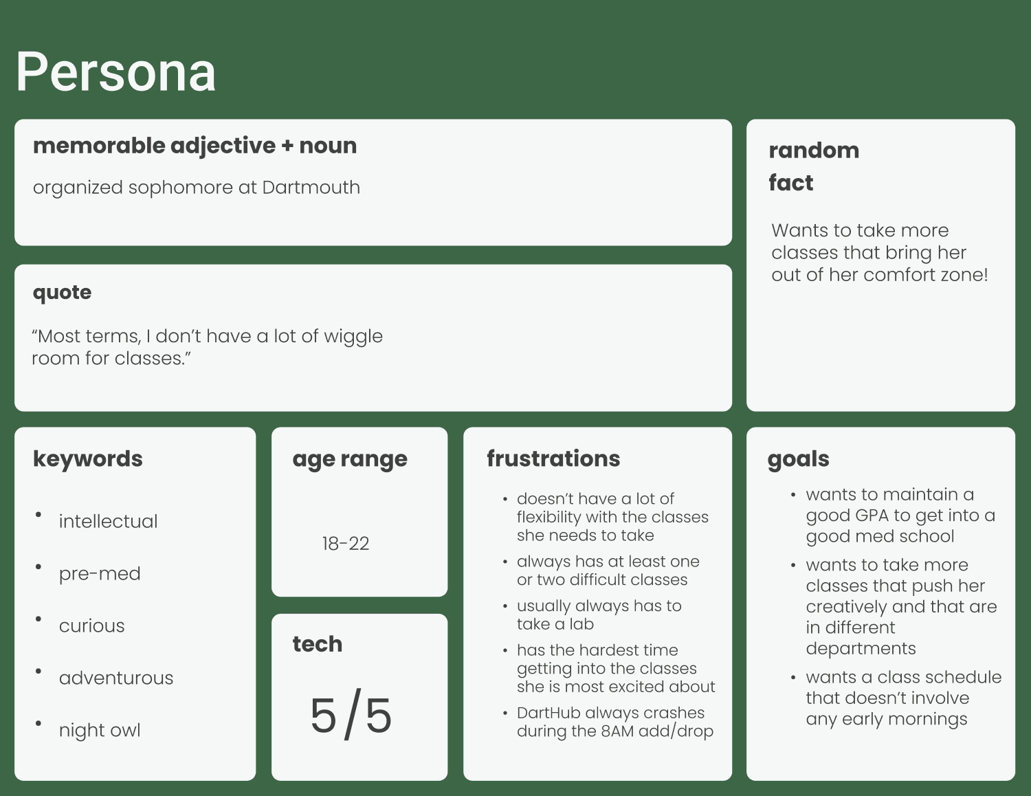
User Persona
From our extensive research and analysis, we then created user personas in order to empathize with our users’ perspectives.
DEFINE
POV Statement
A busy, academic Dartmouth student needs to easily and delightfully register for courses in order to have a smooth and fulfilling course registration experience.
encourage and inspire students to understand and fuel their academic curiosity through a course registration system?
simplify the course registration process so that it feels intuitive and fair for students?
provide better guidance for students in navigating the course election process, both technically and experience-wise?
ensure that students have a more pleasurable experience in envisioning and implementing their academic vision for their upcoming term?
streamline the three-ponged course registration experience and the overwhelming amount of information provided?
help make Dartmouth students’ course election process more smooth and delightful, with more fulfilling and considered choices made?
make the course election process and intellectually fulfilling, exciting, and simple experience?
help Dartmouth students make more considered choices when electing courses (first round), knowing full well the risks they are taking and how likely they are to get in, resulting in a higher probability of getting in all the classes they want?
encourage interaction between students who have taken classes and who are looking to take it?
simplify the three-pronged course registration experience while also fostering delight and academic fulfillment?
How might we...
IDEATE
IDEATE
IDEATE
HMW Statements
Flow Sketches
Feature Prioritization
We crafted many “How Might We” statements and chose one that best matched our users’ needs, our goals, and our partner’s expectations for the project.
With this HMW statement in mind, we brainstormed potential design solutions, went through rounds of selection to decide on the core features, and sketched a preliminary user flow.
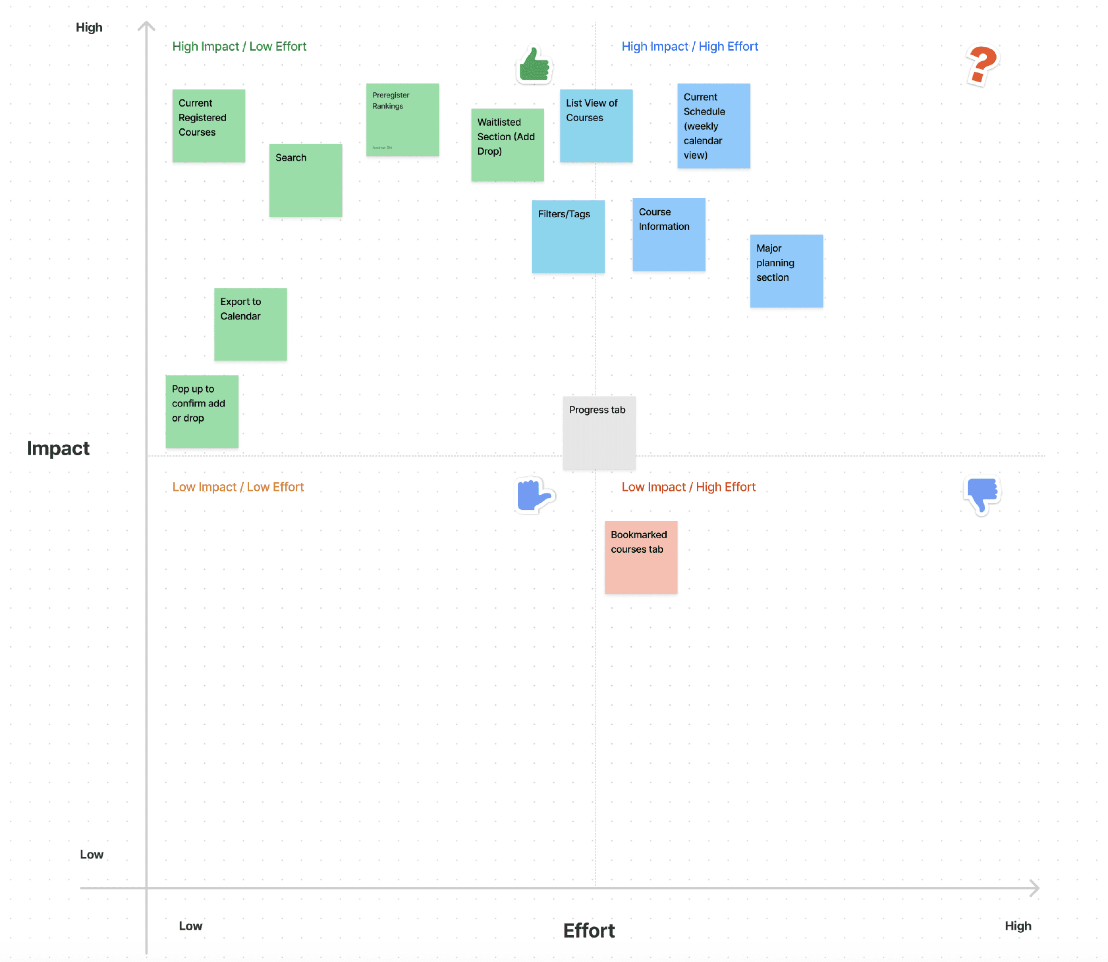
Upon listing out the features we hoped to include in our final prototype, we conducted some feature prioritization. We created an impact/effort matrix to decide which features to focus on first.
PROTOTYPE
PROTOTYPE
Low Fidelity Wireframes
Visual Design System
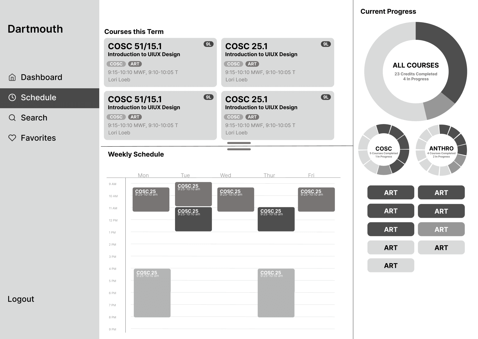
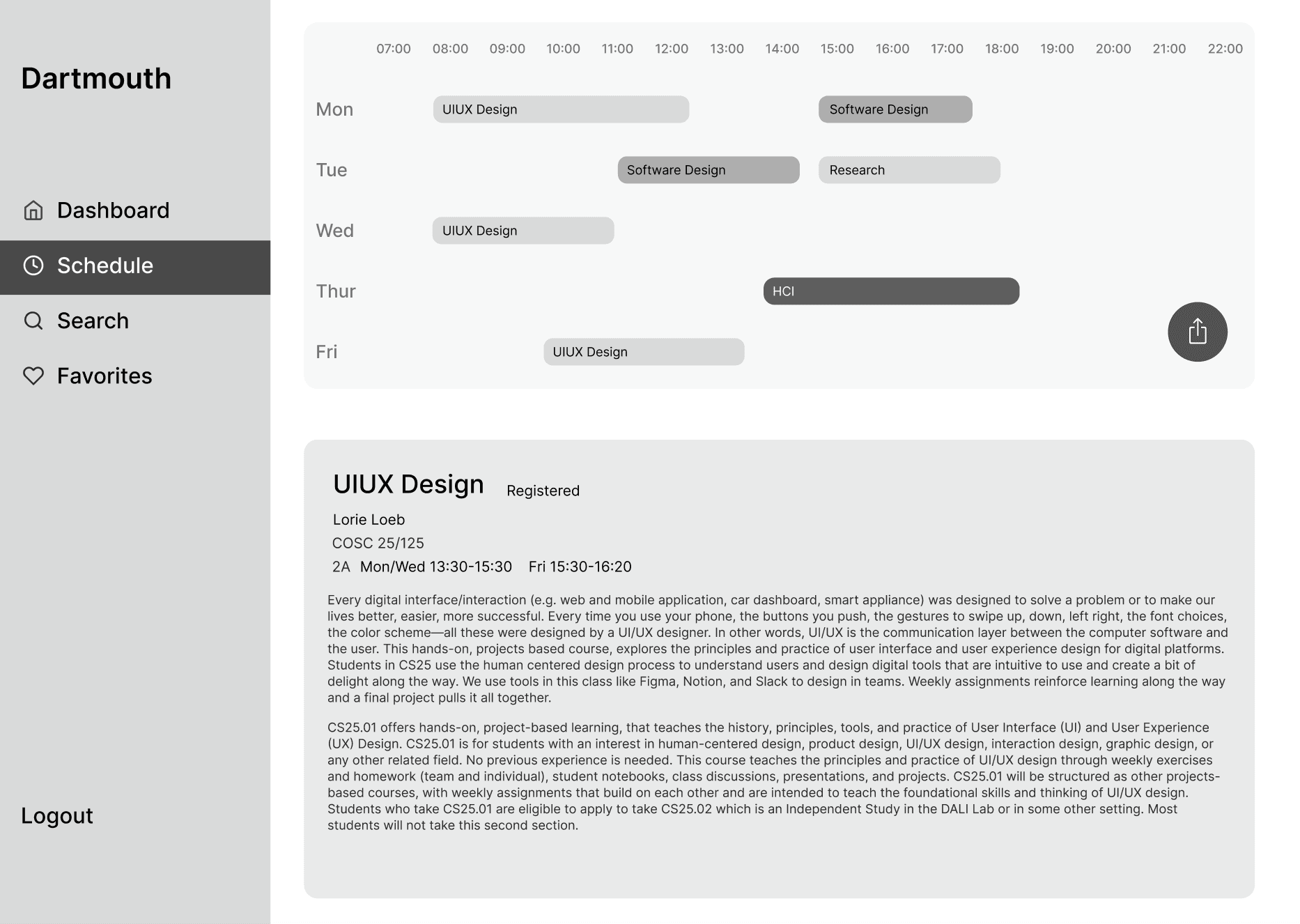
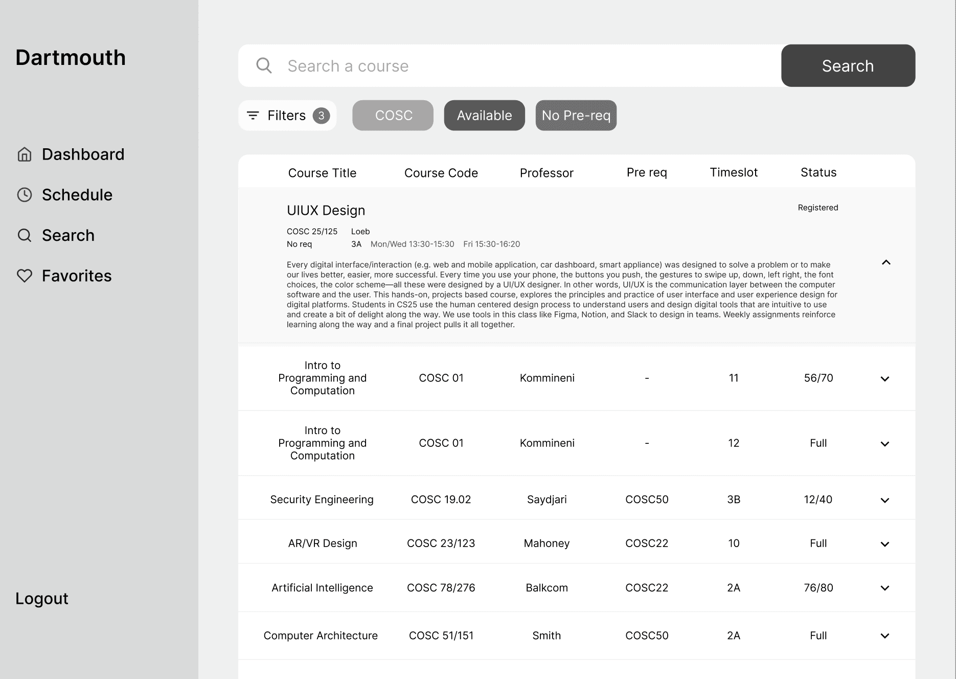
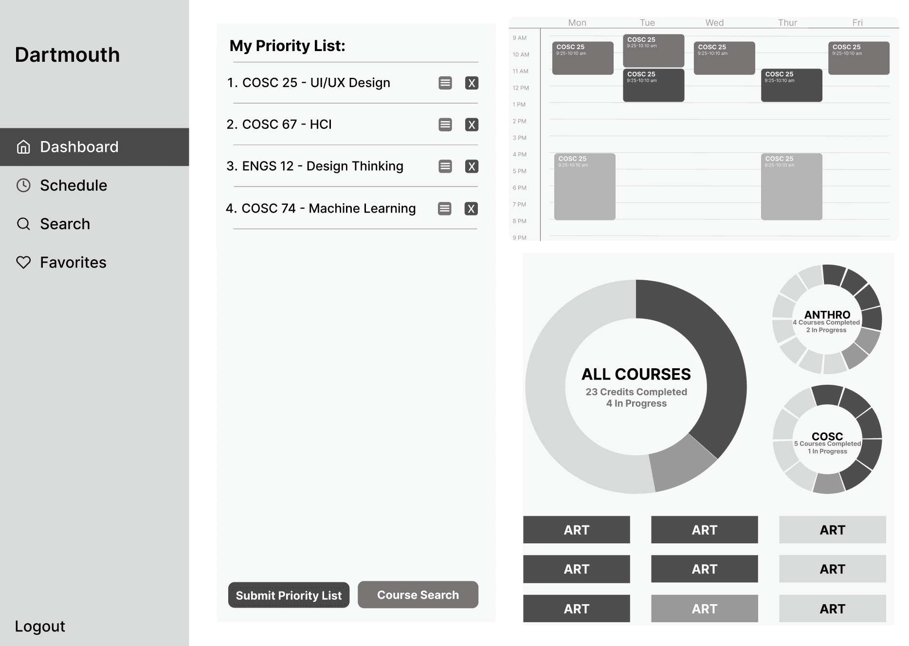
With our feature prioritization in mind, we translated our ideas into low fidelity wireframes.
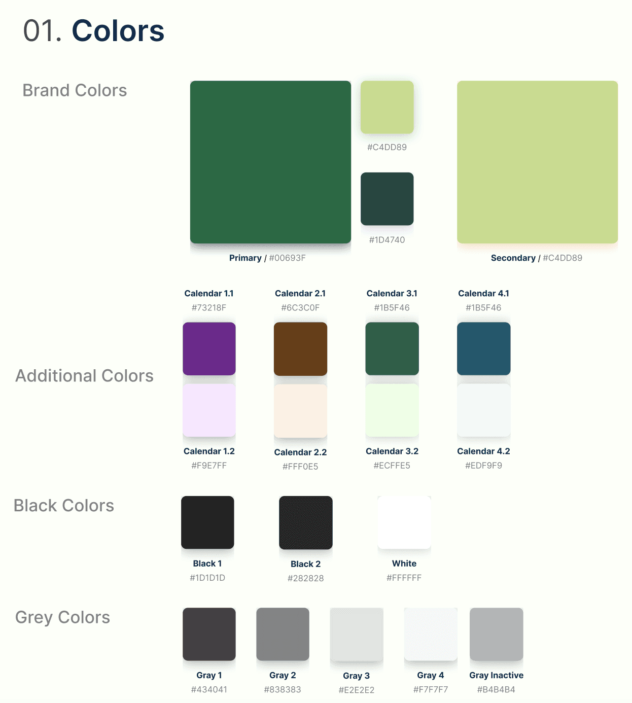
Before creating our style guide, we curated mood boards to decide on the aesthetic of the website. We also kept in mind the constraints of the preexisting Dartmouth style guide.
PROTOTYPE
High Fidelity Prototype
The Dashboard (Course Election Period)
The Dashboard (Course Registration & Adjustment Period)
The Search Page
The Substitution Option
The Bookmarked Page
The FAQ Page

During the course election period, students will be able to elect more than three courses (up to six), ranked according to the student's preferences. An algorithm will combine the department's priority list and the student's rankings to match the courses, reaching a more “fair” distribution of courses for students. We predict this will decrease the user load on the website during the course adjustment period, meaning more satisfied students!
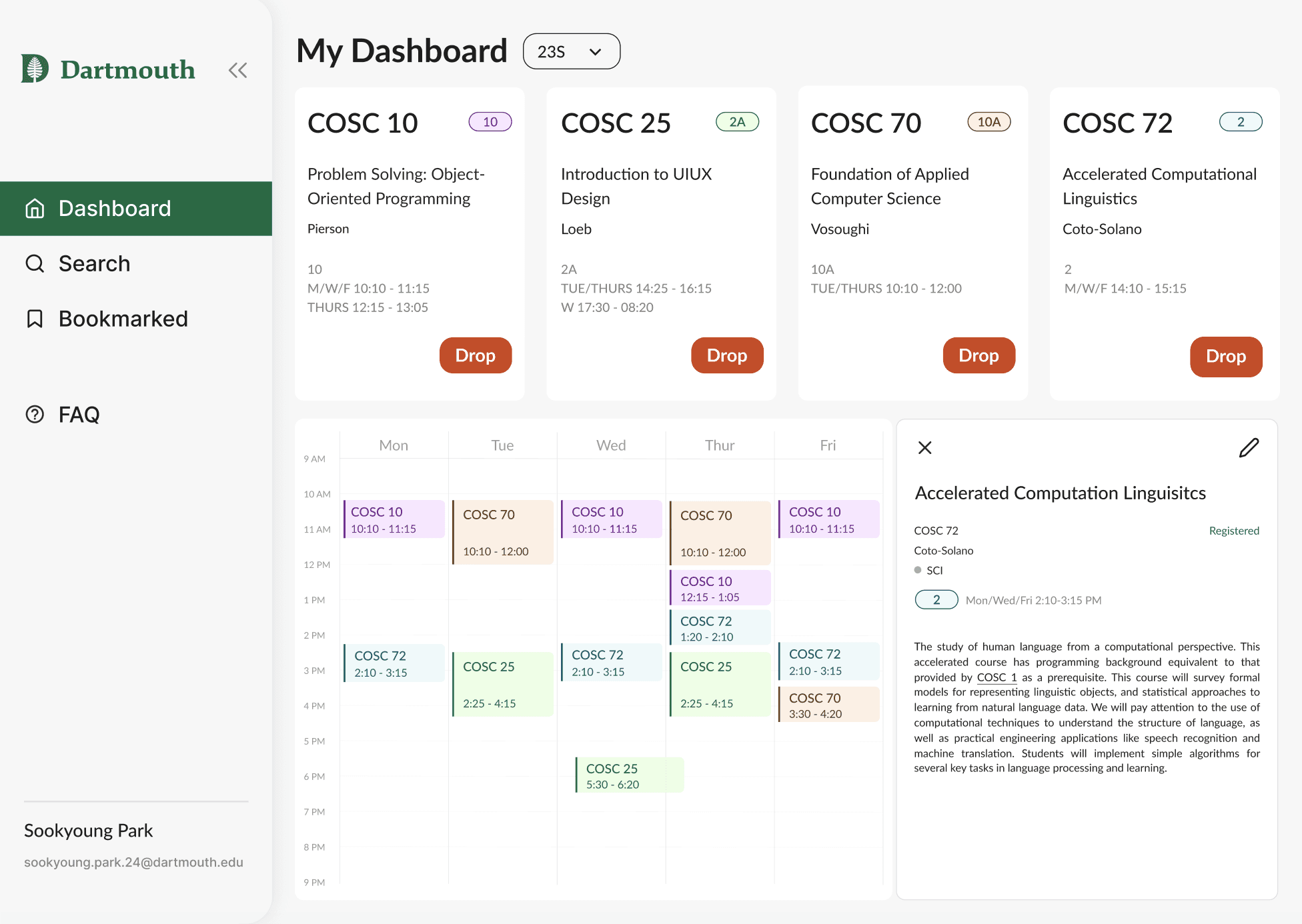
The dashboard changes after the course election period to display the courses students are registered for and a schedule view of those courses. When clicking on their classes, students will also be able to view additional information regarding the courses (such as title, description, professor name, time slot, cross-listing, non-recording option eligibility, current enrollment, size limit, priority info box, etc.) Students can toggle between dashboards of different terms.
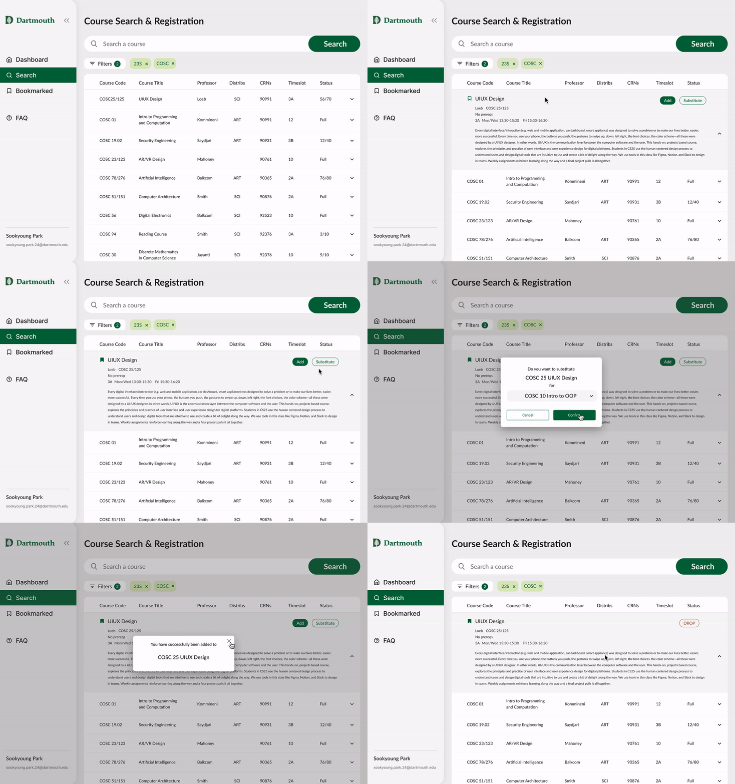
From the scrollable list of courses, students will be able to look up key phrases (such as academic departments, professor name, or course code and name) when searching for courses. Other than the search bar, students can also use and combine filters. These filters include academic term, department, distributive requirement, and time slot.
Courses are then displayed in list format, with additional details for each course listed both on the side and in its expandable section.
Currently, students can register for a maximum of three courses (until the actual term starts). In the situation that a spot opens up in another class, a student would have to quickly “drop” one of their classes in order to register for that new one, risking their spots in either of those classes. To address this issue, we designed the substitution feature. Students would simply click the “substitute” button on their desired new class and substitute it with one of their already registered classes.
Students can bookmark courses, whether it be for their major or for pure interest, and categorize them accordingly. This feature allows them to have more structure during course election and encourages planning and foresight. Folders can be customized to fit the user’s liking. To bookmark a course, students simply click on the bookmark icon when searching for classes.
To alleviate confusion around the course election process, we created an FAQ page.



TEST
Usability Testing
We conducted usability testing with eight Dartmouth graduate and undergraduate students to gain feedback. We asked users to engage with the website as though it were the course election and course registration period, providing them with specific tasks as well as asking for their general opinion on the user interface and experience.
What are your first impressions of the UI?
If you have used Dartmouth registration before, what do you think about it?
What do you think about our redesign?
Were the features intuitive?
What actions were most intuitive to complete?
What did you find confusing?
Are there any features you would like to see?
Were there any features you found unnecessary?
Dashboard (course election period)
Remove COSC70 from your priority list
Reorder your priority list so that COSC25 is priority #1
Look at the course details for COSC25
Dashboard (course registration period)
Drop COSC72 as a course
Petition for 2 course term
Search Page
Look up a COSC class taught in 23S
Bookmark COSC 25
Substitute COSC 25 for COSC 10
Bookmarked Page
Try to edit the “English minor” folder
Delete the “English Minor” folder
FAQ Page
Browse through the questions
Does everything make sense?
Initial Impressions
Concluding Questions
Tasks
TEST
Revisions
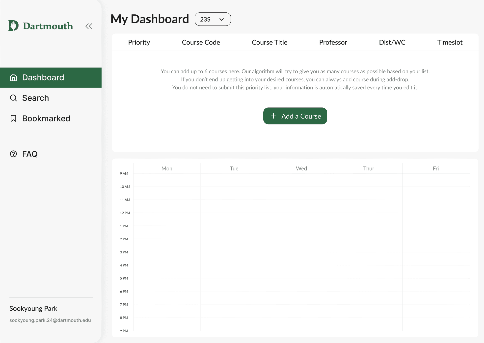
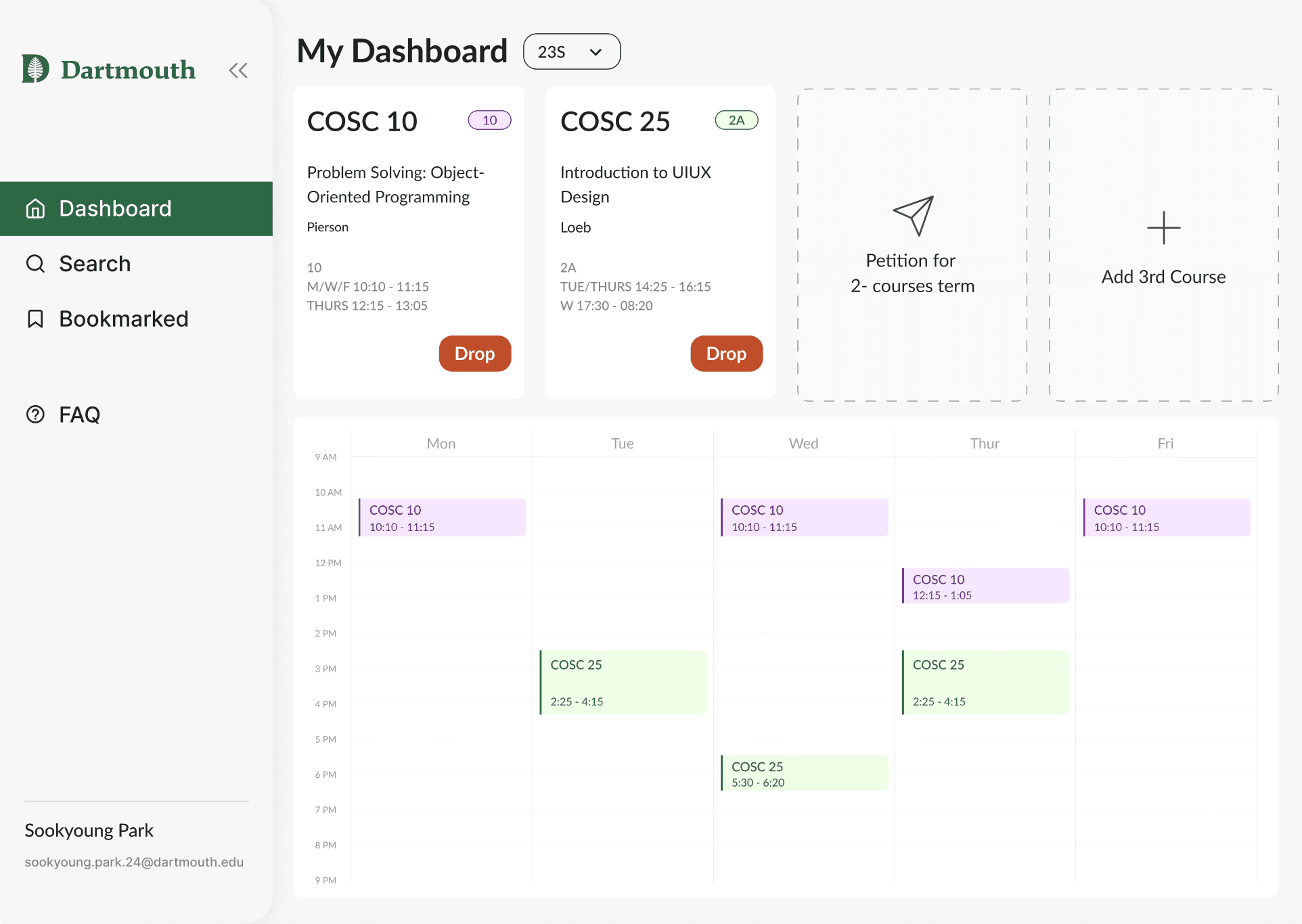
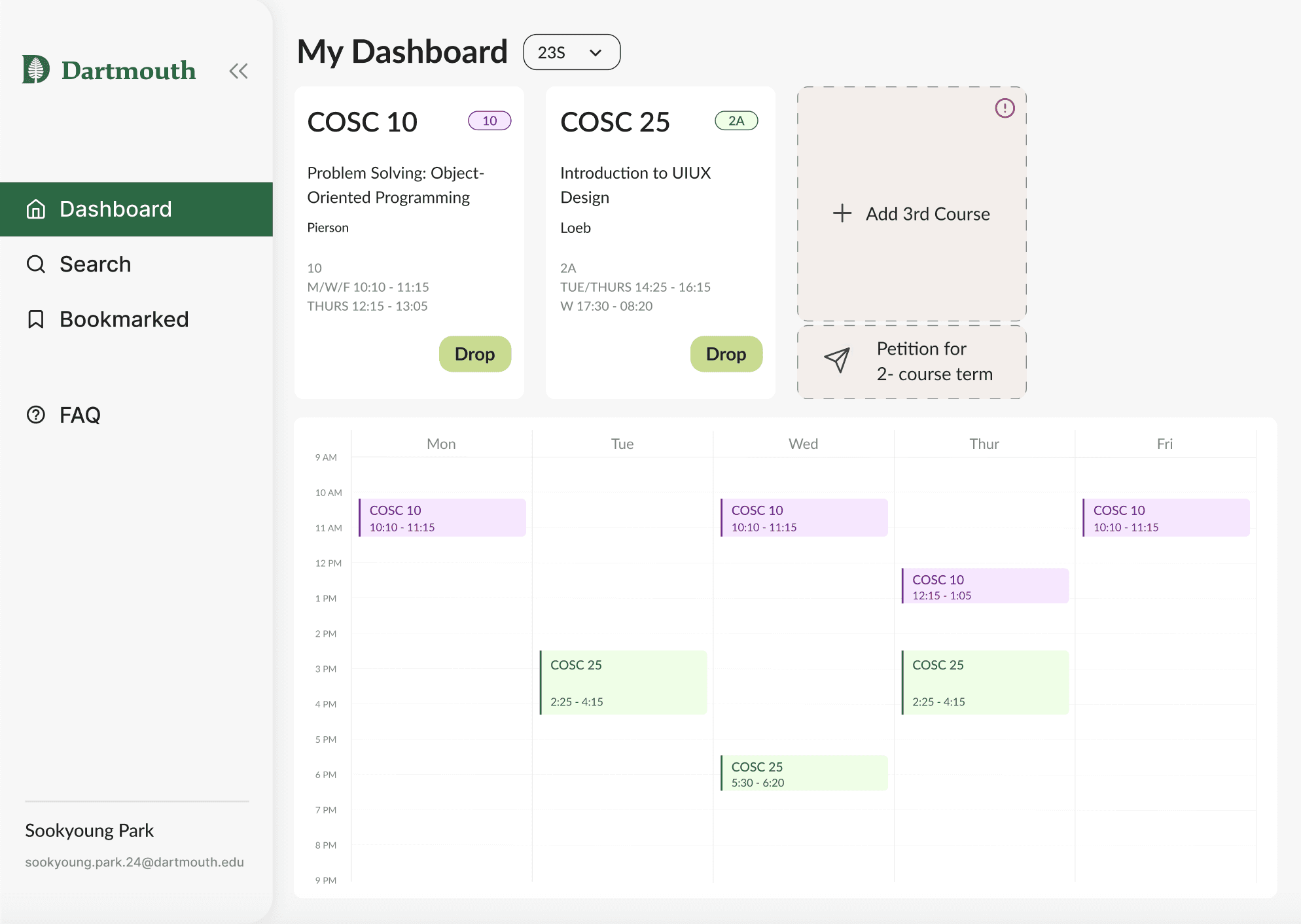
Based on user feedback, we revised our work and implemented three key changes.
Dashboard Accessibility
Priority List Explanation
Course Petitioning
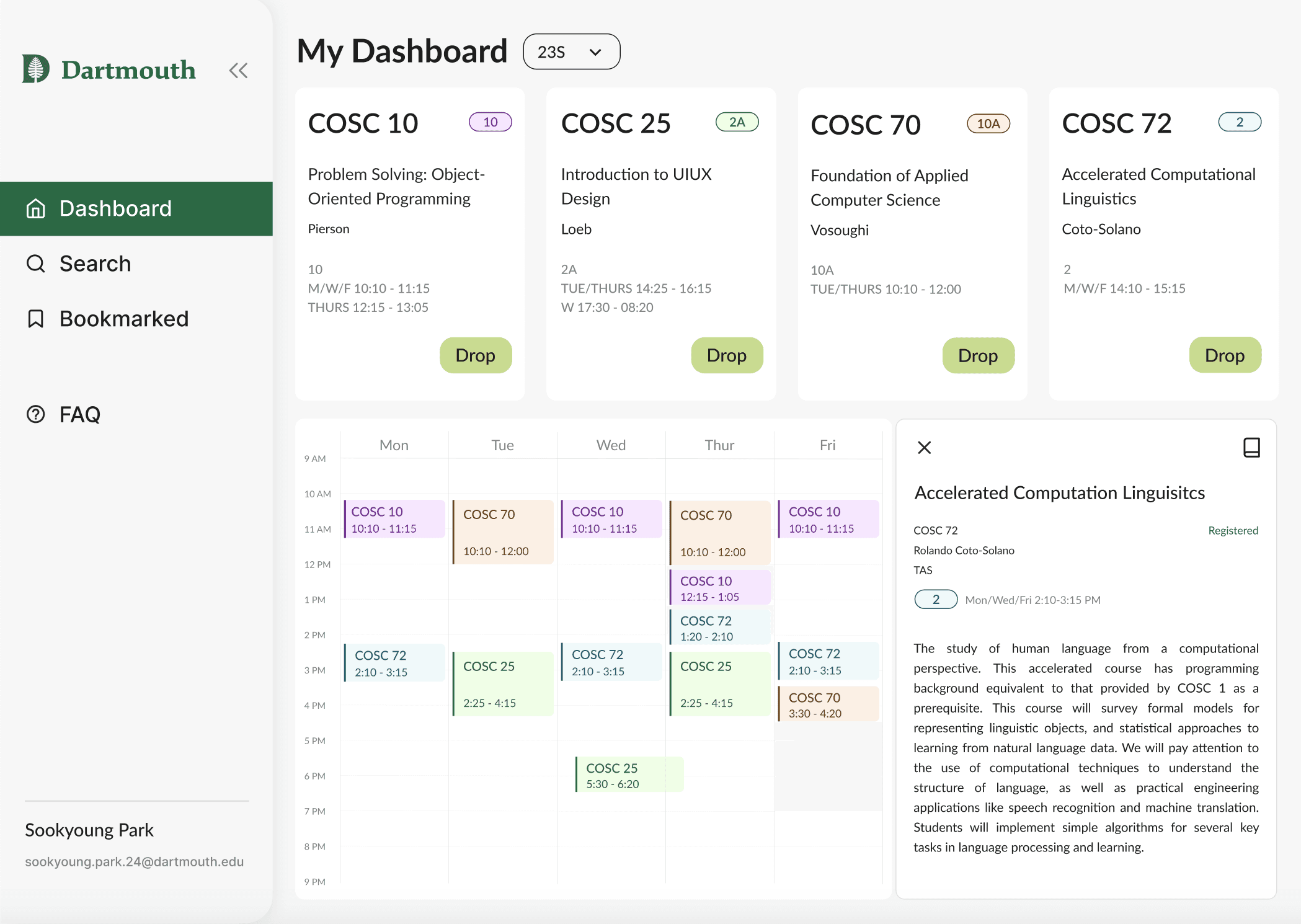
To make our UI more accessible, we changed some colors and increased the text size of the course description to make it easier to read. Many users noted that the red “drop” button almost seemed enticing, so we changed it to match the primary color and also be more accessible.
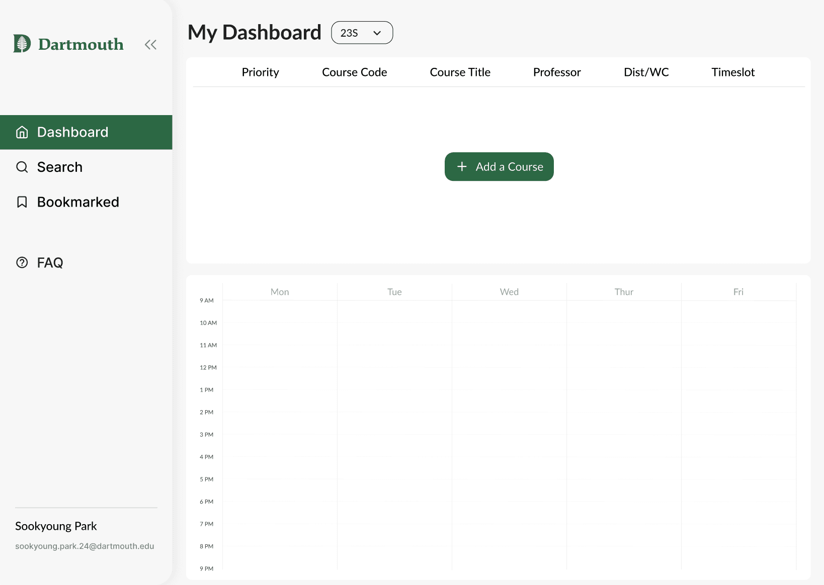
Since the priority list would be a completely new feature for students, we added a description to the null state of the page.
To take more than three two-course terms, Dartmouth students have to petition it to the Registrar’s Office. Originally, our designs had two big buttons — one for course petitioning and one for adding a third course. However, feedback from user testing noted that the buttons were confusing and too big. We fixed the hierarchy and added pop-ups so that it made more sense to students.
REFLECT
Next Steps
Our project was created for the Dartmouth ITC Office to re-design the course election platform and re-frame the experience as academically fulfilling. Our clients were very excited about our final product, and for the upcoming full launch at Dartmouth.
In continuing this project, we would add more organizational features to help students better plan their courses and have a more stress-free course election process.
First, we would add a Waitlist page.
There, students would see the courses they opted to be in the waitlist of. This feature would take into account the student’s priority list rankings to give students a smoother, fairer waitlist experience.
Second, we would add a Major Planning page.
Students would be able to plan out their 4-years out with major and distribute requirements laid out for them. This would help with course election because students could visualize how this term’s courses fit in.
Third, we would create a progress bar.
This would be visible both in the Major Planning page and in the Dashboard. Students would be able to see their progress towards completing their degree, major, minor, etc.
Last, we would ensure the platform meets the Web Content Accessibility Guidelines.
While we did our best to follow these, educational institutions such as Dartmouth College often have very rigorous requirements. We would suggest go over our designs to make sure they are compliant with the guidelines.
REFLECT
Key Takeaways
Working together with a project manager and designers of varying experiences — all within a tight deadline of 10 weeks — helped me learn many valuable lessons. From the limitations of bringing designs to real life, to the design constraints of working with an academic institution, to cooperation and communication skills, this experience really fueled my creativity and passion for design!
We suggested to our client to establish a development project to replace the current design. We believe that changing the current course registration system would have a positive impact on student experience based on our user research. We, therefore, suggested making this project a high-priority one in ITC’s backlog.
After launch, our project would also benefit from having more user research and iteration, as needed.
thanks for reading
check out more projects