G PPER GUIDE
Empowering and connecting gap year students
Time
Team
Role
Deliverable
10 Weeks
2 Product Designers
Research
Design System
Figma Prototype
UX
Visual
We designed Gapper Guide — a mobile app that encourages gap year students to connect with each other through adventurous and collaborative travel experiences.
This app was our final project for COSC 25.01 (Introduction to UI/UX). As one of the product designers, I spearheaded the user research synthesis, initial solution sketches, and usability testing. The other product designer and I collaborated as a team on the remaining aspects of the project.
BACKGROUND
PROBLEM
OPPORTUNITY
Gap years have become increasingly popular over the last couple of decades, with many students opting to postpone college for a year, stretch their wings and experience learning outside of the education system.
However...
There is a lack of resources tailored specifically for gap year students.
Gap year students feel disconnected from their high school friends, their peers at their future college, and each other.
Many gap year students do not know others also on a gap year and feel disconnected from their peers. When looking for opportunities to pursue there was an overwhelming amount of information that was neither accessible or actionable.
Gap year students need to feel empowered and connected by their gap year plans in order to make the year feel worth it.
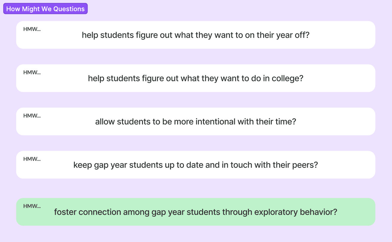
How might we foster connection amongst gap year students through exploratory behavior?
SOLUTION
G PPER GUIDE
a mobile app that connects gap year students, coordinates their plans, and complements their enriching experiences
G PPER GUIDE
Empowering and connecting gap year students
check out the process
Research
Define
Test
Reflect
Ideate
Prototype
Competitive analysis
User interviews
HMWs
Brainstorming
Crazy 8s
Solution sketches
Low fidelity wireframes
Visual design system
High fidelity prototype
Usability testing
Revisions
Next steps
Key takeaways
Empathy maps
User personas
Journey maps
POV statements
PROCESS
RESEARCH
Competitive Analysis
We began by researching gap years (what they are, how common they are, what most students do during this year, etc.) as well as what resources are tailored specifically for gap year students.
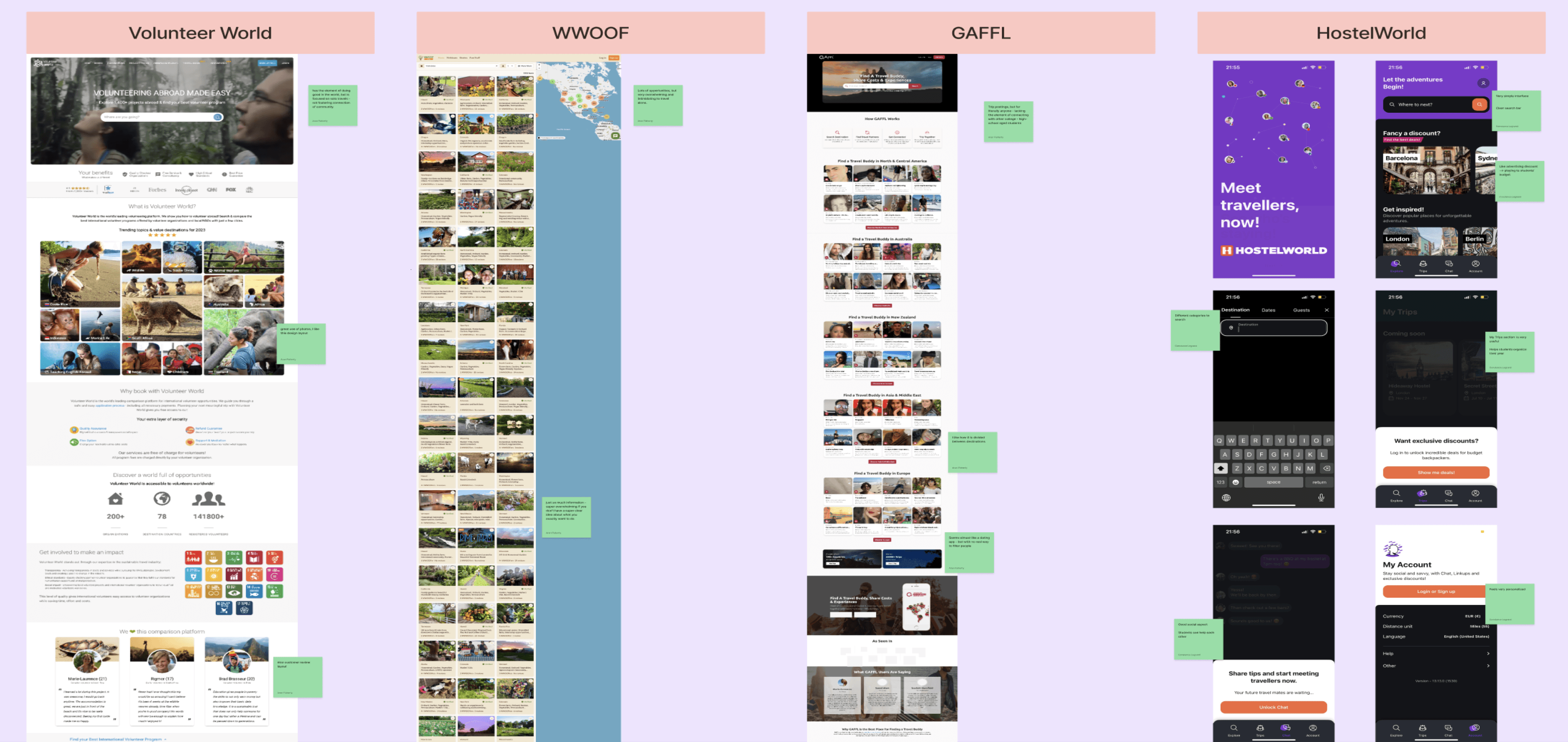
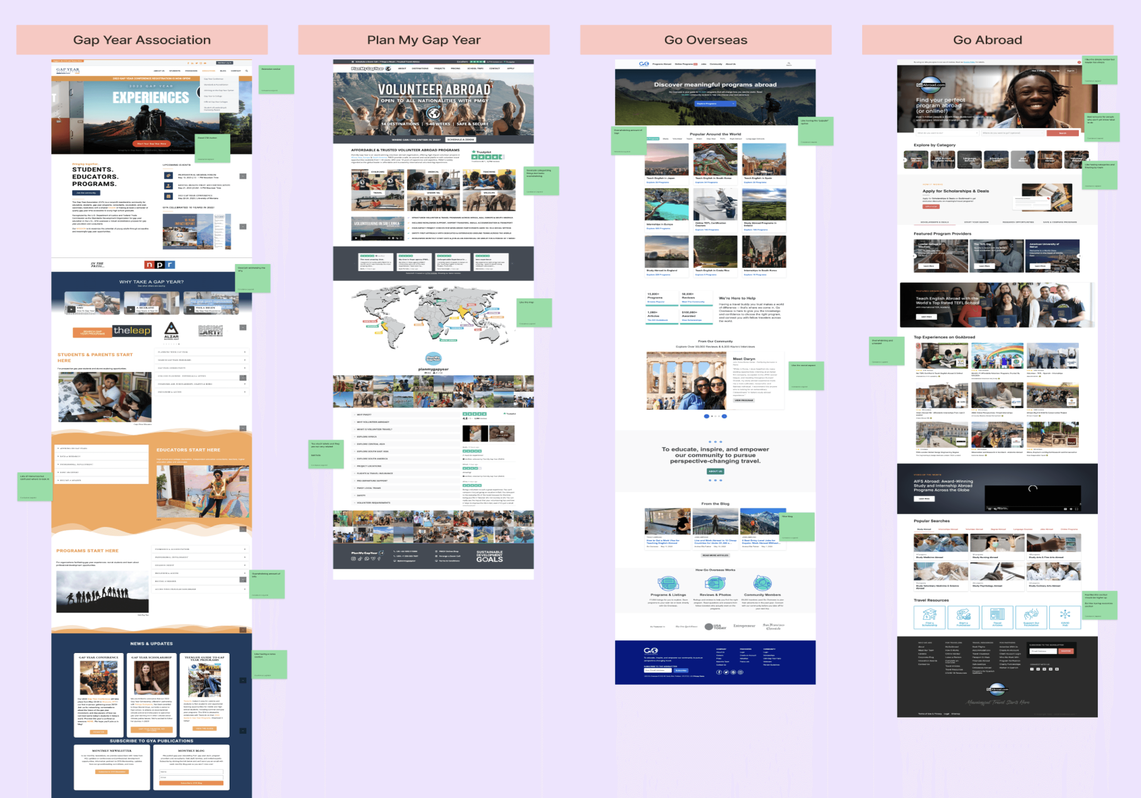
We found that there is no other platform designed for students on gap years to connect with other like-minded peers to pursue self-proposed travel adventures.
Volunteer Programs
Seasonal work opportunities
Connect with travel buddies
Formal education opportunities
None of these options offer informal opportunities to travel with like-minded peers on trip that your peers have planned
RESEARCH
User Interviews
To gather deeper insights, we conducted in-depth user interviews with students who had taken gap years before attending college.
Our questions sought to gather information about their experiences during their gap years, the methods used to plan their gap year, the limitations of existing gap year resources, and their critical reflections of their gap years.
User Interview Questions
To start off, could you tell me a little bit about your gap year?
Why did you decide to take a gap year?
Tell me about one of your favorite memories from your gap year. What made it special?
Tell me about a negative experience you had in your gap year.
How did you go about organizing your gap year?
What were you long-term goals, if any?
What resources did you use?
Did your initial plans change over the course of the year? How so? Why?
If you could do your gap year again, what would you change about it? Why?
How do you think you changed (if so) over the course of this year?
How has your perception of your gap year changed over time?
What do you think could make this a better experience?
“
I didn’t know I was burnt out until I took a gap year. This year was so valuable for me.
“
I should’ve taken more risks with the experiences I engaged in.
“
I never would have considered a gap year if it wasn’t for COVID, “I was a by the book try-hard high schooler that never would have wanted to waste my time.”
“
The hardest part about planning trips was finding people to do them with, especially because I really didn’t know anyone.
“
I learned so much more about myself and how to spend time alone.
“
I felt very lost and purposeless when my plans got cancelled.
We identified many memorable quotes:
DEFINE
DEFINE
DEFINE
IDEATE
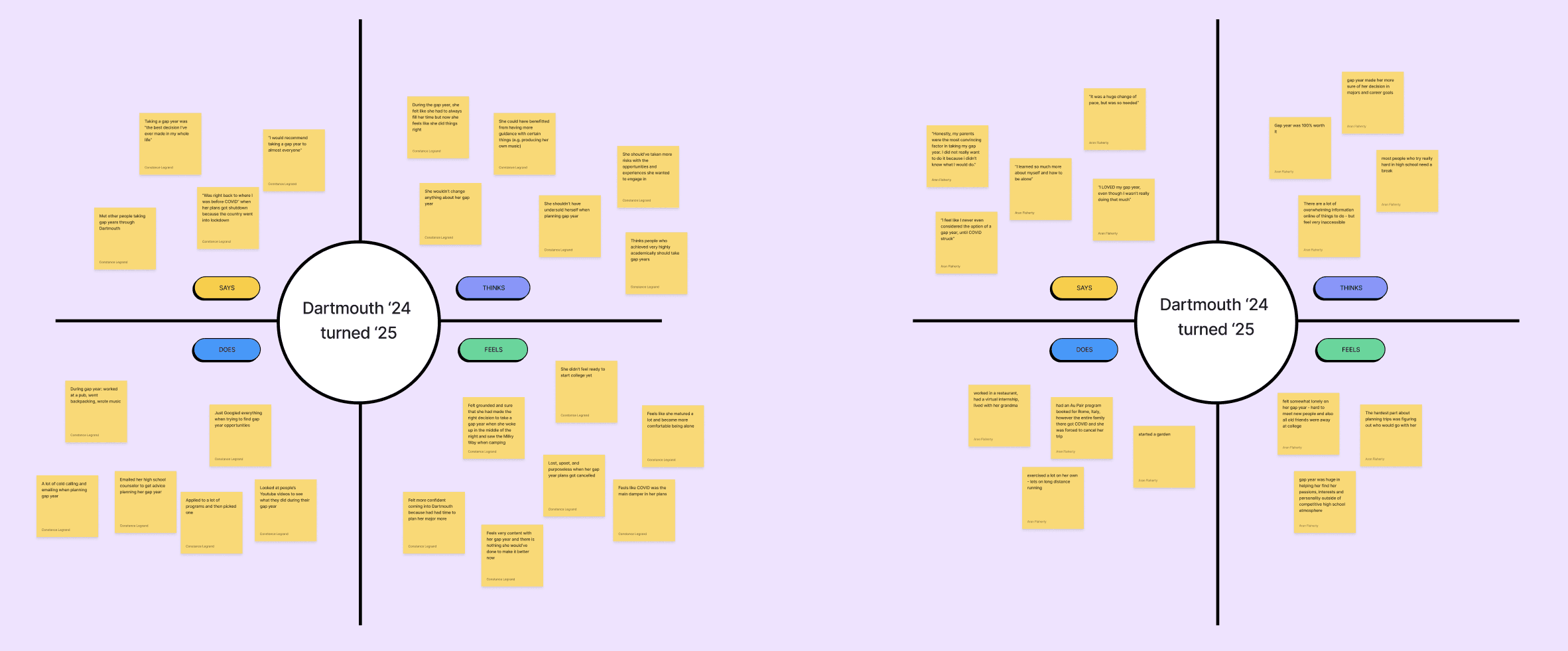
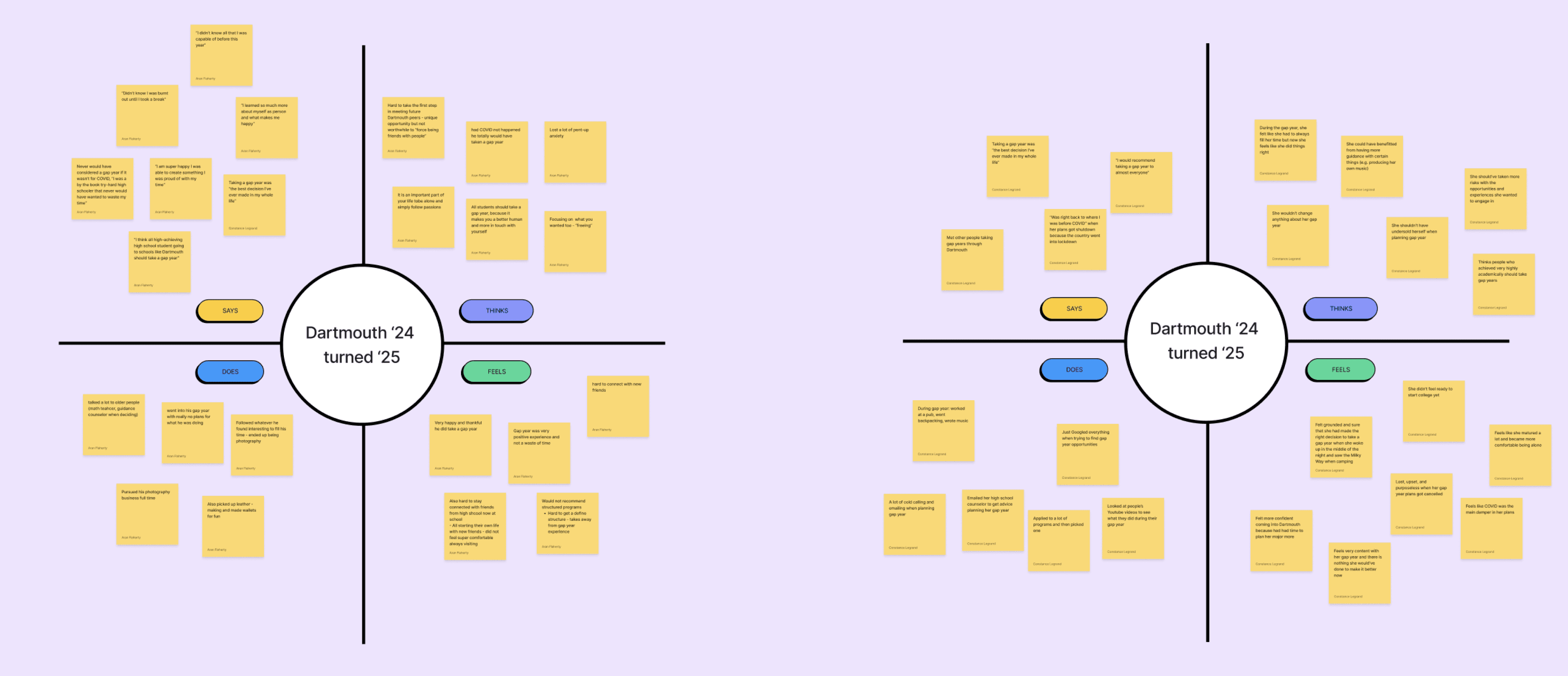
Empathy Maps
User Personas & Journey Maps
POV Statement
HMW Statements
Based on our user interviews, we created empathy maps to further understand our users’ most latent needs.
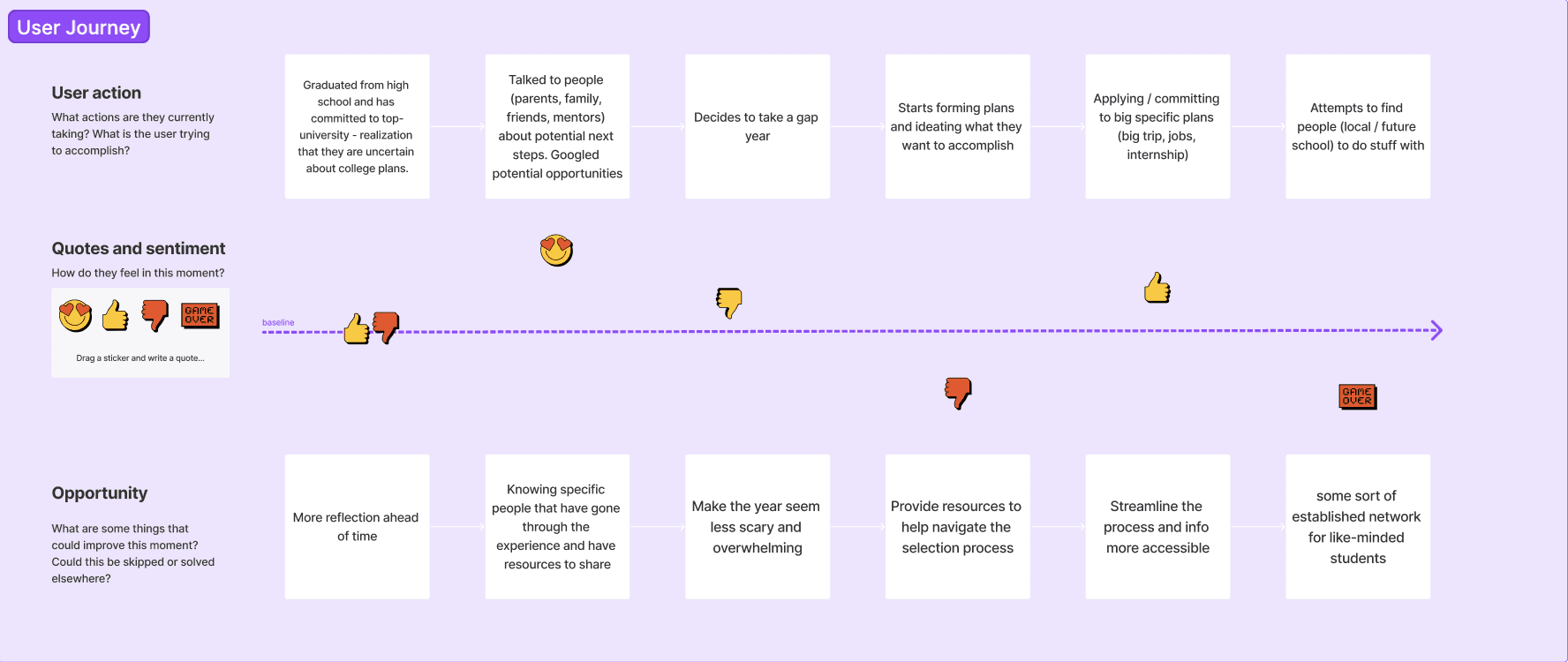
From our extensive research and analysis, we then created user personas and user journey maps in order to empathize with our users’ perspectives.
Overachieving, organized high school student about to start a gap year
Only person from their high school taking a gap year
Hard-worker in high-school & committed to top school
Does not have much travel experience
Unsure of what they exactly want to do
Wants to try new things on their gap year
Eager to meet new people also taking a gap year
Students taking gap years need to feel empowered and connected by their gap year plans in order to make the year feel worth it.
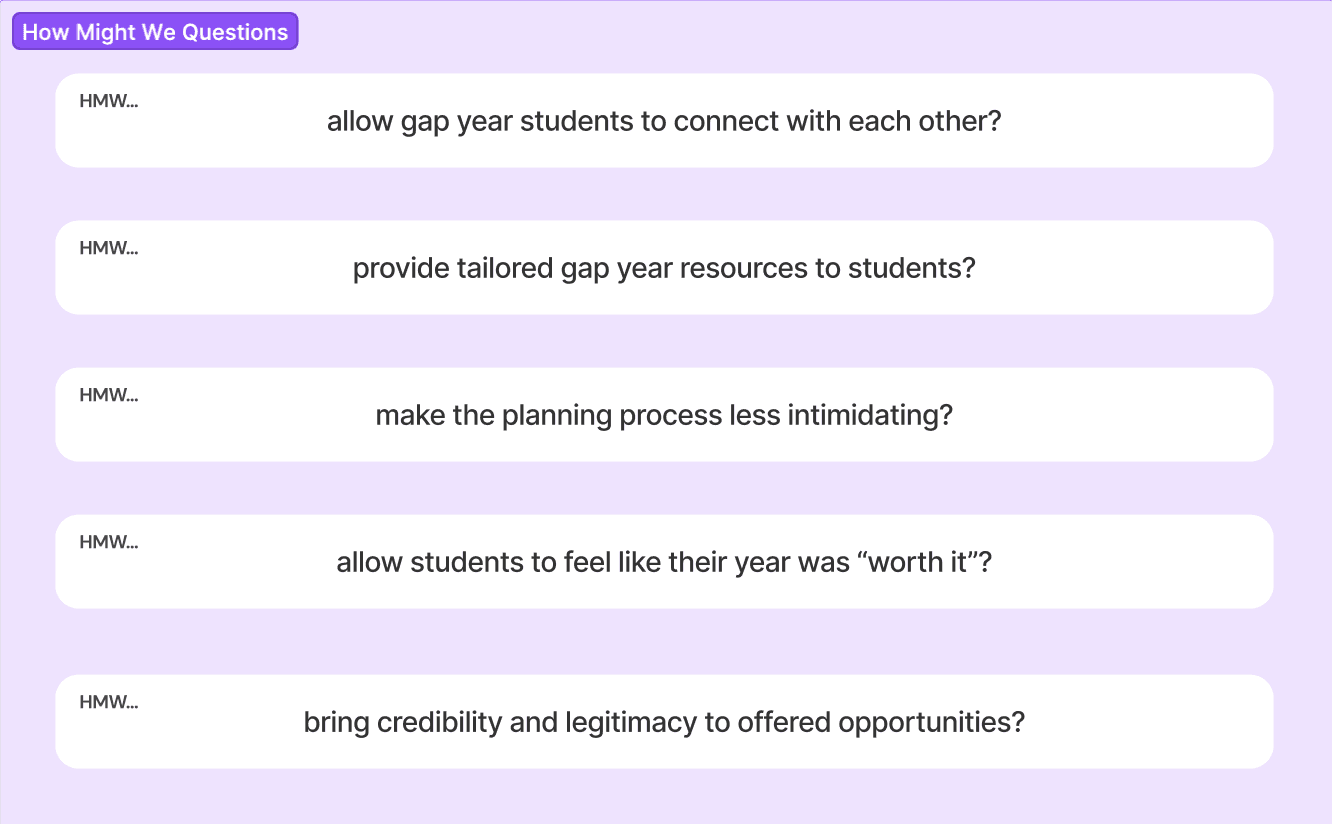
We crafted many “How Might We” statements and chose one that best matched our users’ needs and our goals for the project.
How might we foster connection among gap year students through exploratory behavior?
IDEATE
IDEATE
IDEATE
PROTOTYPE
PROTOTYPE
PROTOTYPE
Brainstorming
Crazy 8s
Solution Sketches
Low Fidelity Wireframes
Visual Design System
High Fidelity Prototype
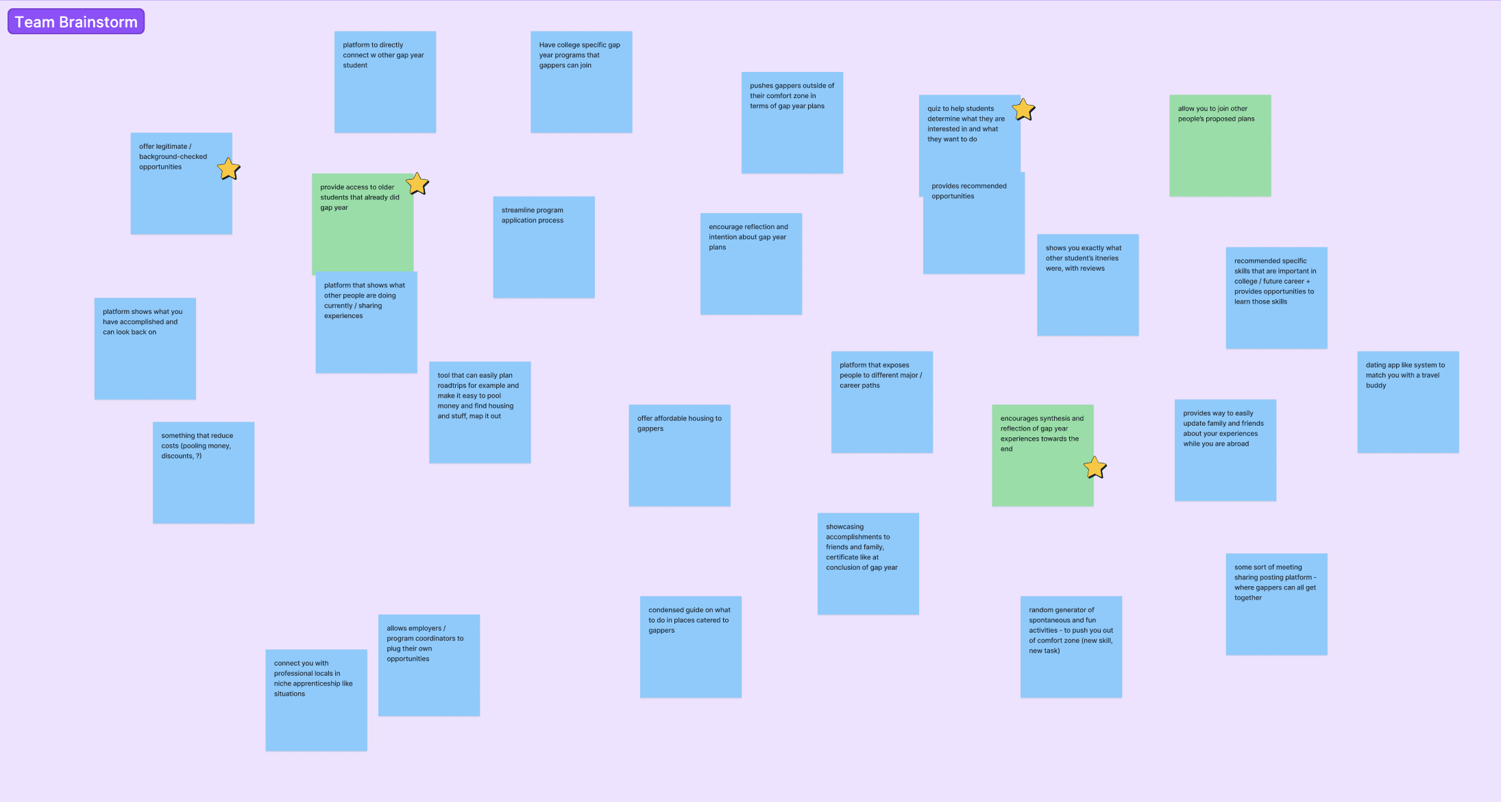
Based on our HMW statement, we brainstormed many ways of addressing the user need and used dot voting to choose our favorite concepts.
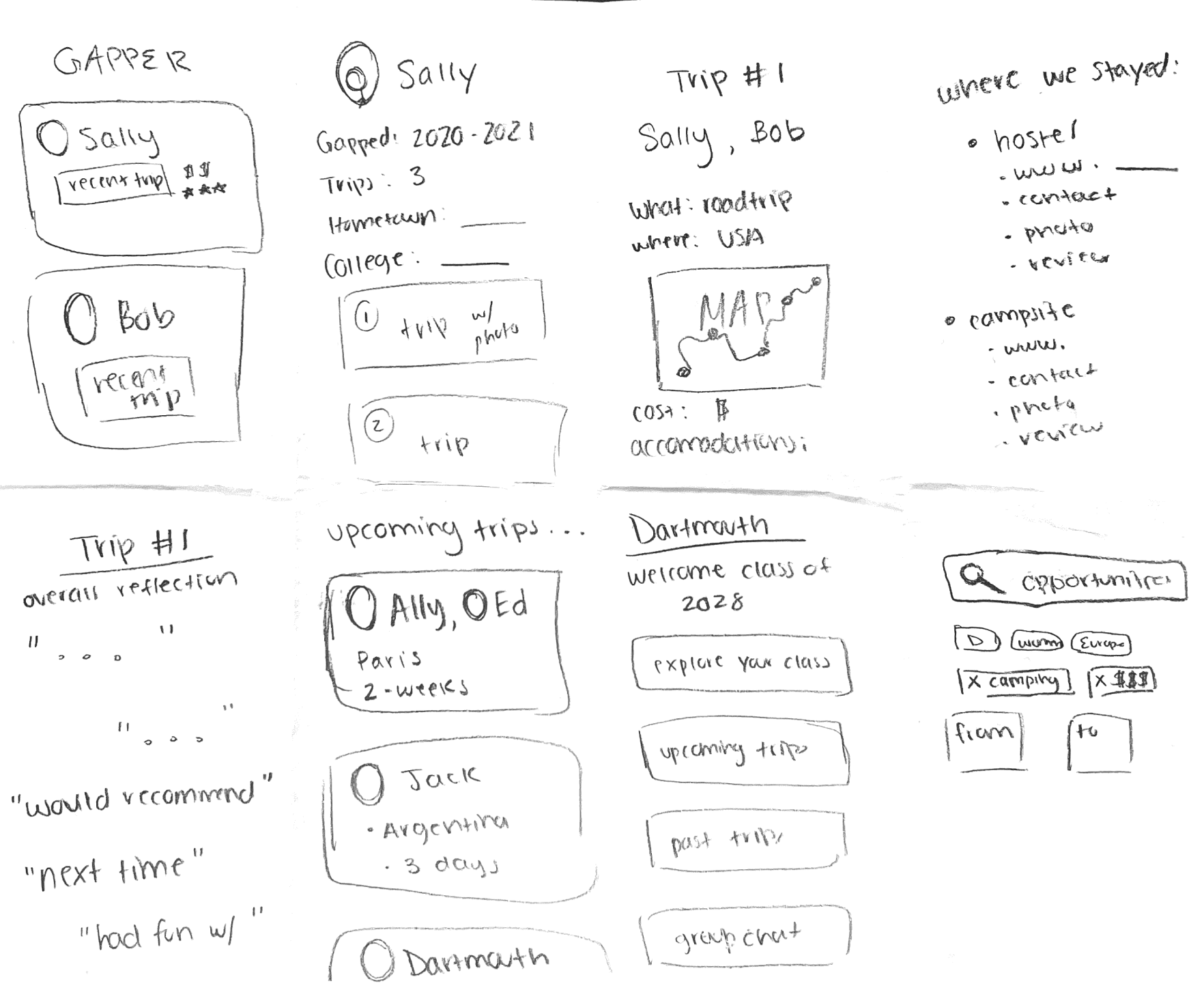
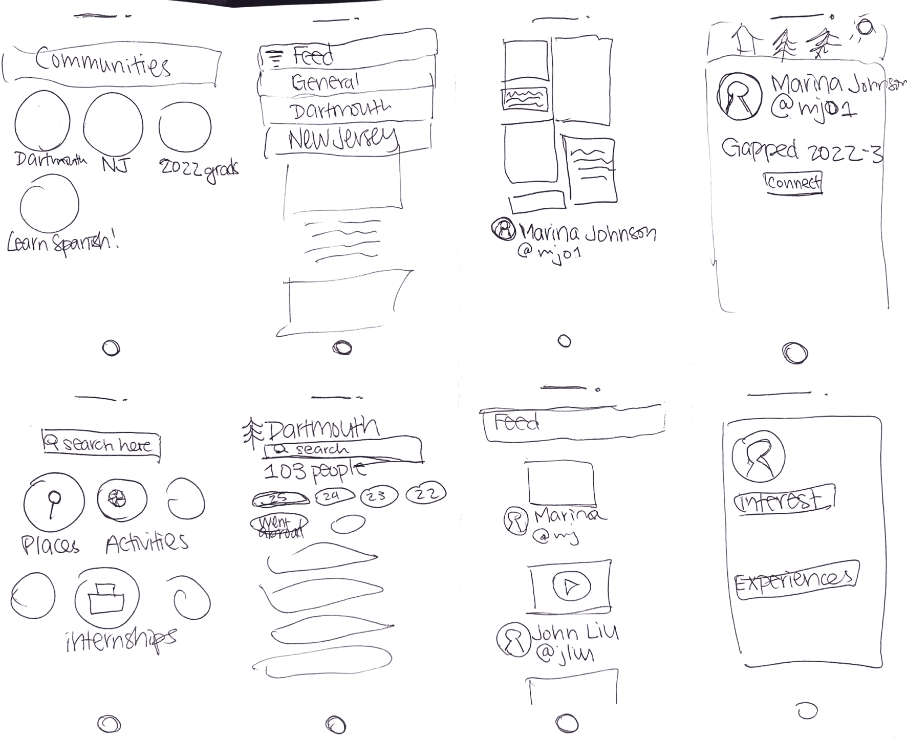
With all these ideas in mind, we sketched out designs using the Crazy 8s method — we drew a new screen every minute for a total of eight minutes, giving us each a total of eight screens.
After dot voting for our favorite screens, we refined our sketches and produced seven more polished screens.
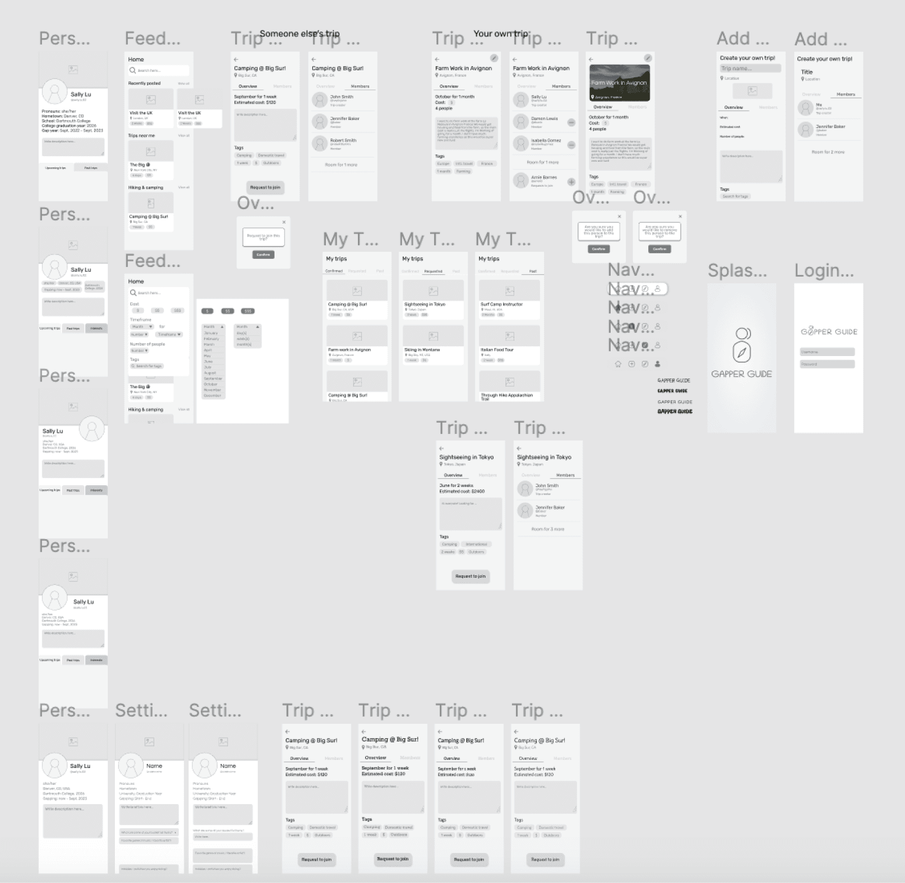
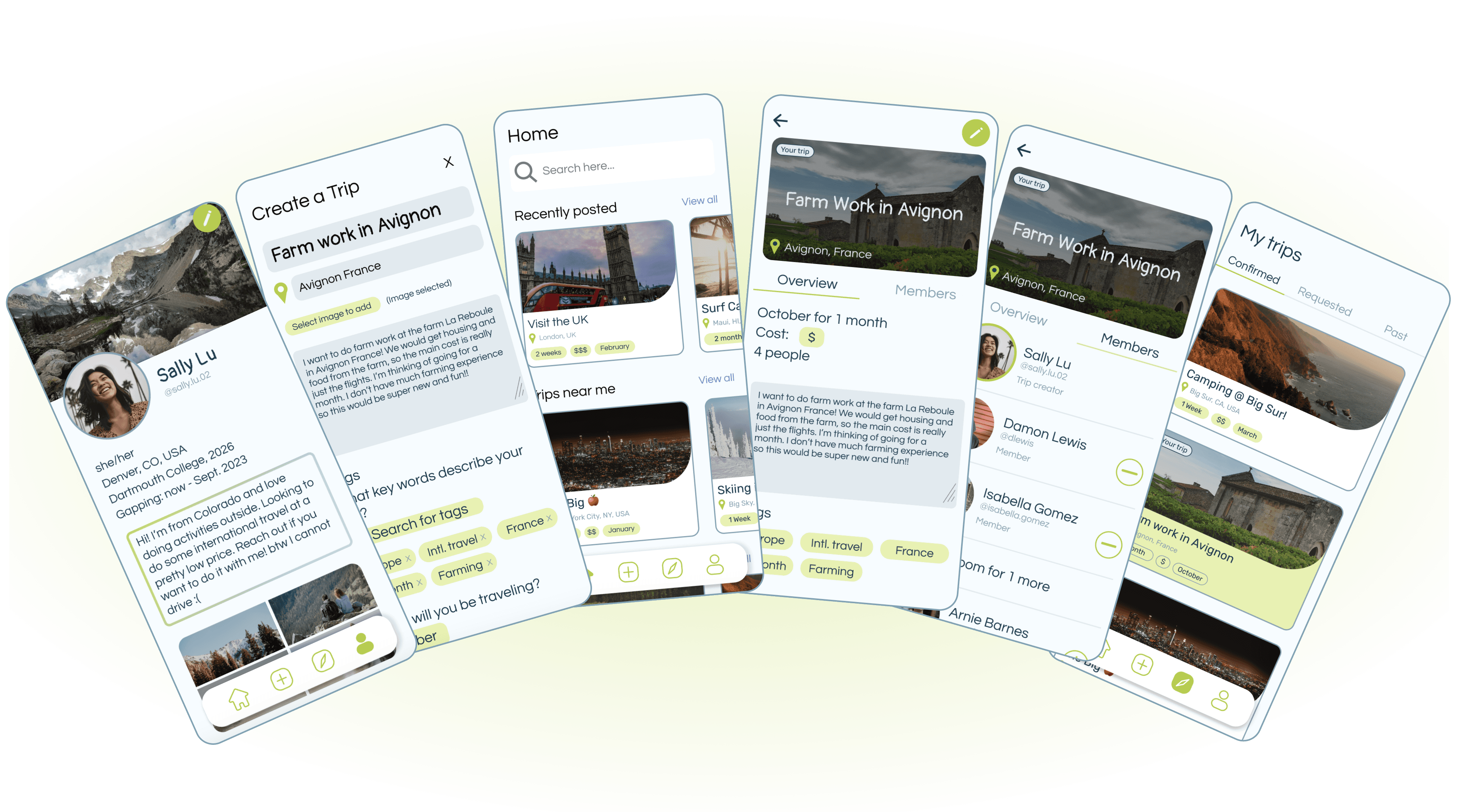
We translated our ideas from our brainstorm and solution sketches into low fidelity wireframes. To begin, we decided on four essential pages:
Before moving into more high fidelity designs, I created a style guide that aligned with both the app’s playful nature and its target demographic (young students).
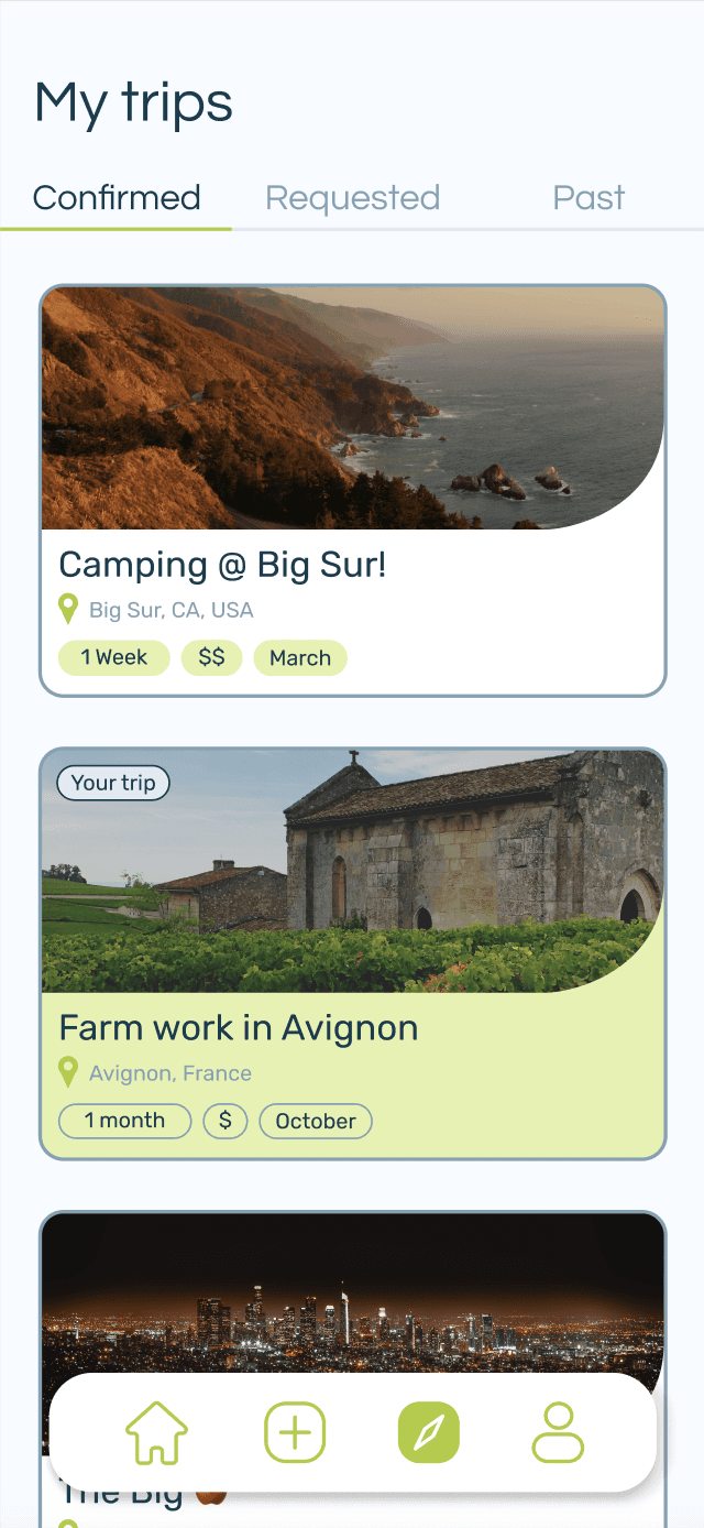
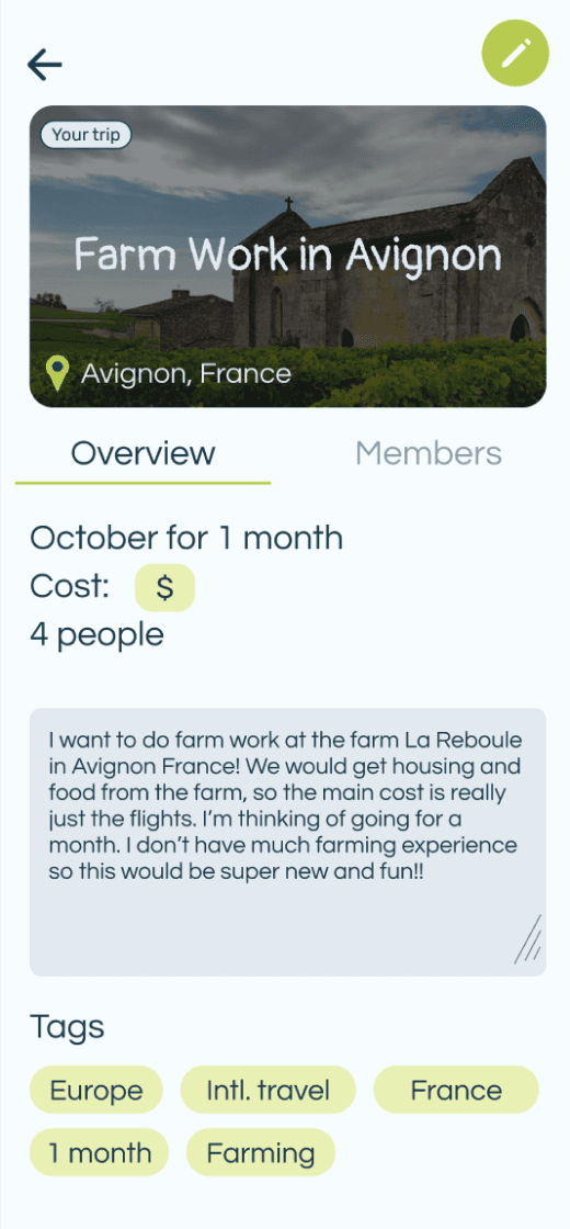
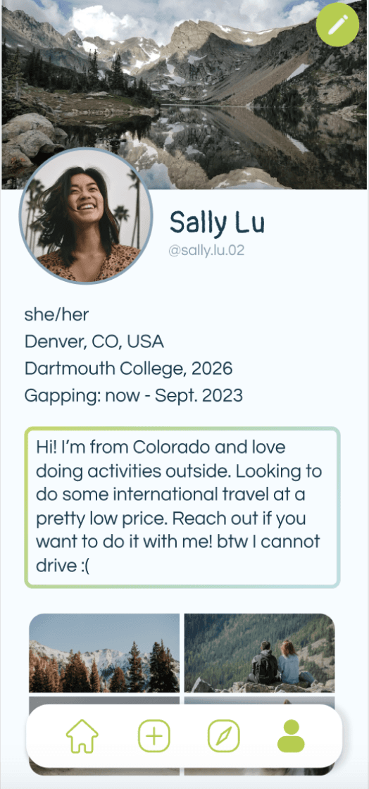
Taking into consideration our key user insights and our HMW statement, we created a high fidelity prototype.
To gain further inspiration, we curated a mood board and conducted comparative analysis with mobile apps about travel. We then began quickly designing and iterating on the wireframes.
Home page (a feed with a search function)
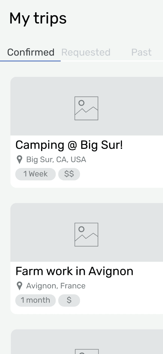
“My Trips” page (view you past and future trips)
Trip creation page (to create and post trips)
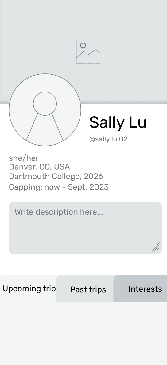
Profile page

Colors
CTA Secondary
E5F2AC
Background
F6FCFF
CTA Primary
B0CD32
Main text
0F3C4D
Grey text
80A2B4
Light Text
E0EAF0
Typography
Regular Text
Questrial
24 pt
Smaller text
Questrial
16 pt
Title Text
Pangolin
32 pt
TEST
TEST
REFLECT
REFLECT
Usability Testing
Revisions
Next Steps
Key Takeaways
We conducted usability tests through UserTesting.com and received feedback from six users between the ages of 19 and 25. We asked users to engage with the app as though they had just graduated high school and decided to take a gap year before college.
Based on user feedback, we revised our work and implemented three key changes.
In continuing this project, we would like to do more user testing. Our initial feedback has been pretty positive with people eager to use the app. There are some conflicting opinions on the app’s UI, related to fonts and style.
Gapper Guide was created to address the lack of resources and connection between gap year students. Creating a platform specifically tailored for gap year students in which they can create and join adventures they are interested in. We have addressed the very real need for gap year students to find community and have access to each other.
This project was both a challenging and rewarding experience. By staying open to user feedback, we were able to produce a final prototype that addresses the pain points of the user. Willingness to pivot and iterate was essential. And, most importantly, cooperation and adaptability between us, the two team members, were what made this experience both rewarding and special.
People also suggested that our user group has the potential to expand beyond those just taking gap years between high-school and college, such as people traveling alone or in small groups.
If we had more time, we would also keep prototyping some of our features and create more pages to make the app more robust and interactive.
For instance, we would add features such as:
pages for every college to interact with your peers
unlocked contact information to safely and efficiently plan logistics
more variety in trip tags to streamline searching for trips
details about necessary experience and/or equipment to communicate participant qualities
complete basic app functions
express what their first impressions of the app were
engage with the main features and functions
provide feedback on what they liked and disliked
suggest potential edits and next steps
We prompted them to...
User Profile
Logo
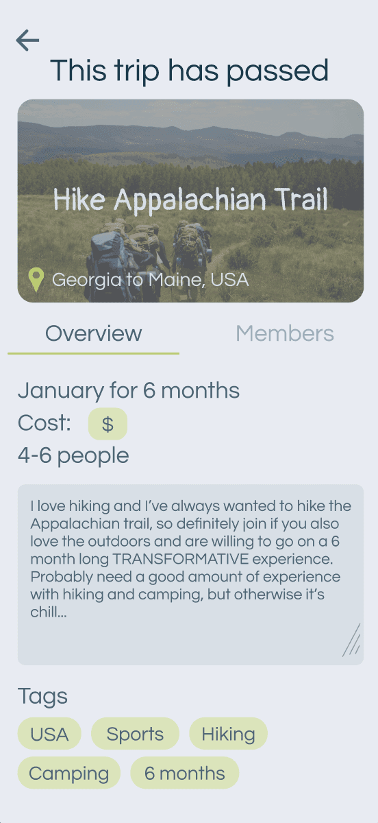
Past Trips
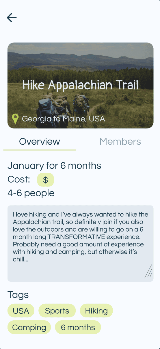
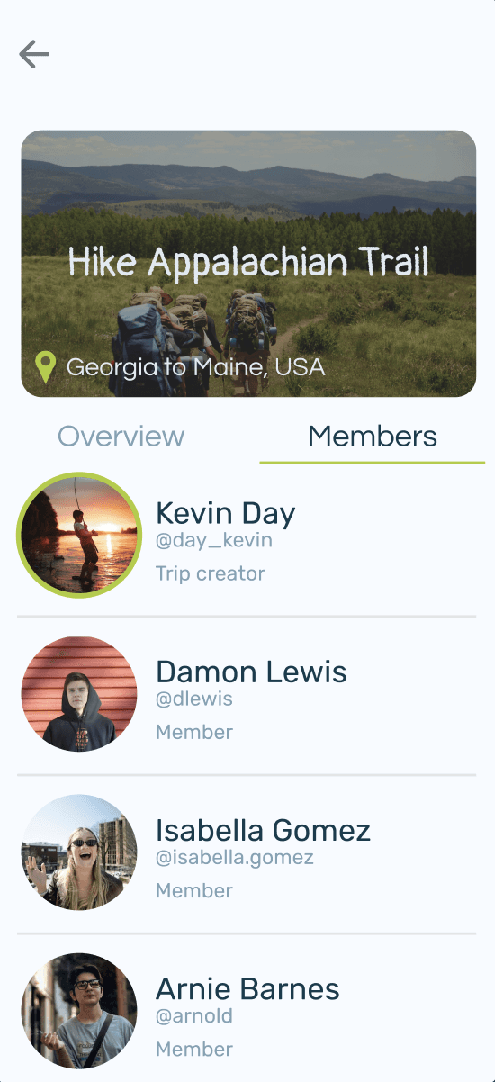
To make our UI look more modern and better fit the target audience (college-aged students), we changed the text blocks and background.
To address concerns that our icon does look like an ‘A,’ we shifted the needle of our compass to be more horizontal. Our users responded positively to this shift.
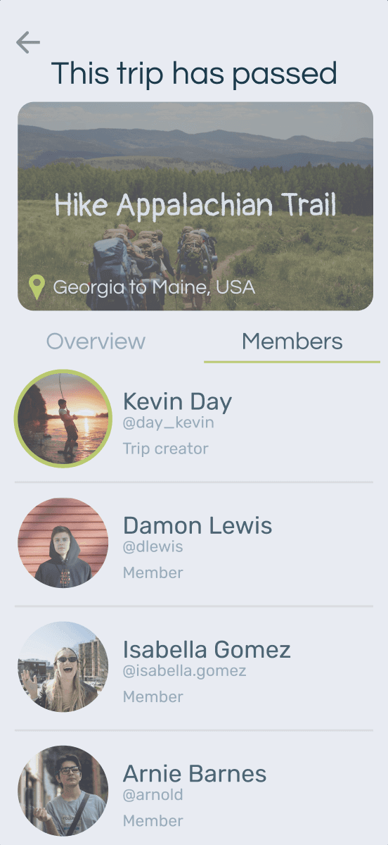
To make it more clear that a trip had already taken place, we overlayed the trip page with a faded blue frame. This helped make it abundantly clear that the trip had expired, but users could still reference the information desired.


G PPER GUIDE
G PPER GUIDE
thanks for reading
check out more projects