RESEARCH
Industry Research
We wanted the educational platform to be consistent with other similar platforms. At the same time, we wanted it to stand out and excite users. Therefore, we began by conducting an industry analysis on similar platforms, taking note of any trends, necessary components, and unique elements that were present. Doing so allowed us to identify what makes a digital educational platform successful.
Coursera
Khan Academy
Duolingo
Udacity
Skillshare
Edx
Google Education
Class Dojo
We looked at 8 educational platforms...
{
Research
Define
Test
Reflect
Ideate
Prototype
Industry research
Mood boards
Literature review
HMWs
Flow sketches
Feature prioritization
Low fidelity wireframes
Visual design system
High fidelity prototype
Usability testing
Revisions
Next steps
Key takeaways
User personas
POV statements
PROCESS
RESEARCH
Mood Boards
To further get a feel of what the platform would look like, we created mood boards. These included appealing colors, graphics, content organization. While these design choices were not implemented immediately, they were important for us to keep in mind as we began designing.
We regularly came back to these mood boards throughout the process.
check out the process
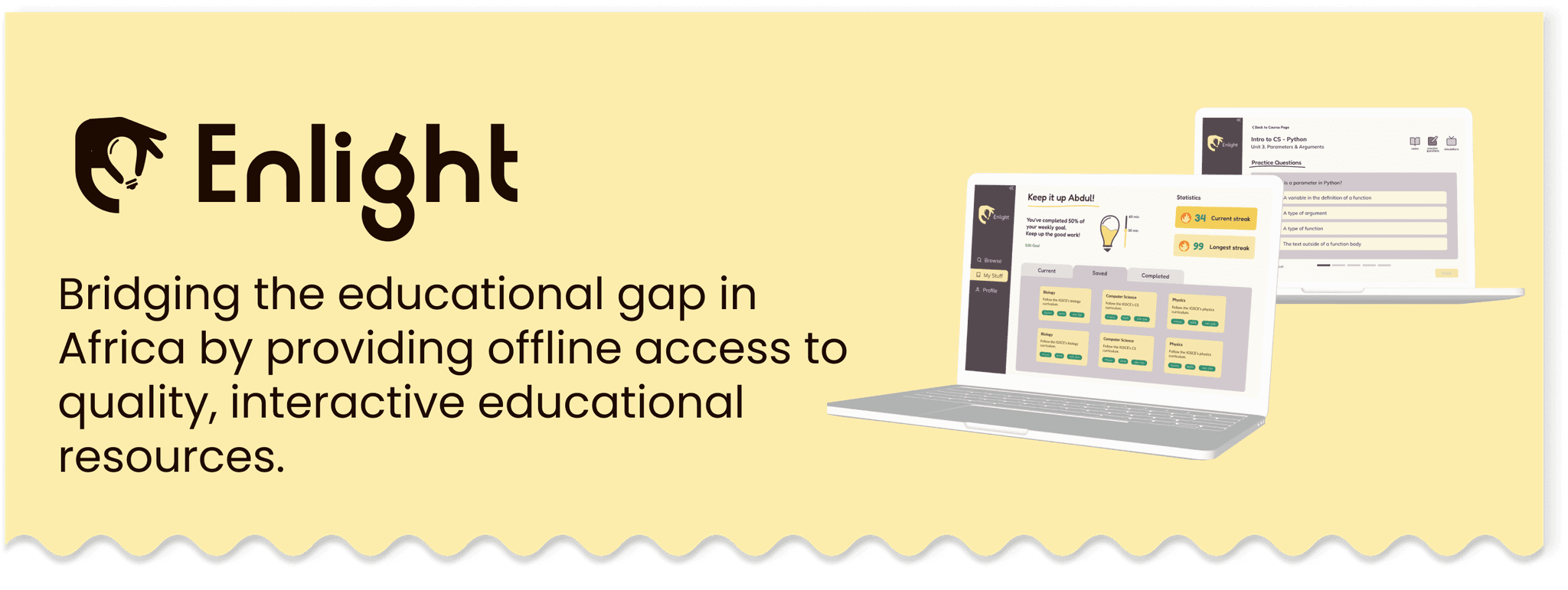
Bridging the educational gap in Africa through accessible, curated educational content
Enlight
This project’s process differed from the usual design process because the partner came to us with a minimum viable product. They had already begun the design and creation process and tasked us with extending their work. Therefore, we had to work within the constraints of their existing work.
At the same time, the partner team also wanted us to rebrand their image. Other than keeping their logo and title font, we had the freedom to reimagine what Enlight looked like.
In 10 weeks, we...
Designed, developed, and deployed:
A landing Site
The student-facing learning platform
Designed and Figma prototyped:
The educator-facing platform

Learn what Enlight stands for
Enlight strives to empower students with unparalleled access to quality educational materials. Learn more about Enlight’s mission, journey, and founders as well as access the learning platform through the landing site.
Browse and take courses based on your interests
From the Browse page, users can view recommended courses, access in-progress courses, and search and filter through all available courses. Each course is broken into digestible units to simplify the learning experience.

Engage in interactive learning
Each unit is packed full of content. From reading lessons to engaging in simulation and doing practice questions, the learning experience is diverse and interactive. Issues can be easily reported to ensure the platform runs as smoothly as possible.

Visualize your learning journey
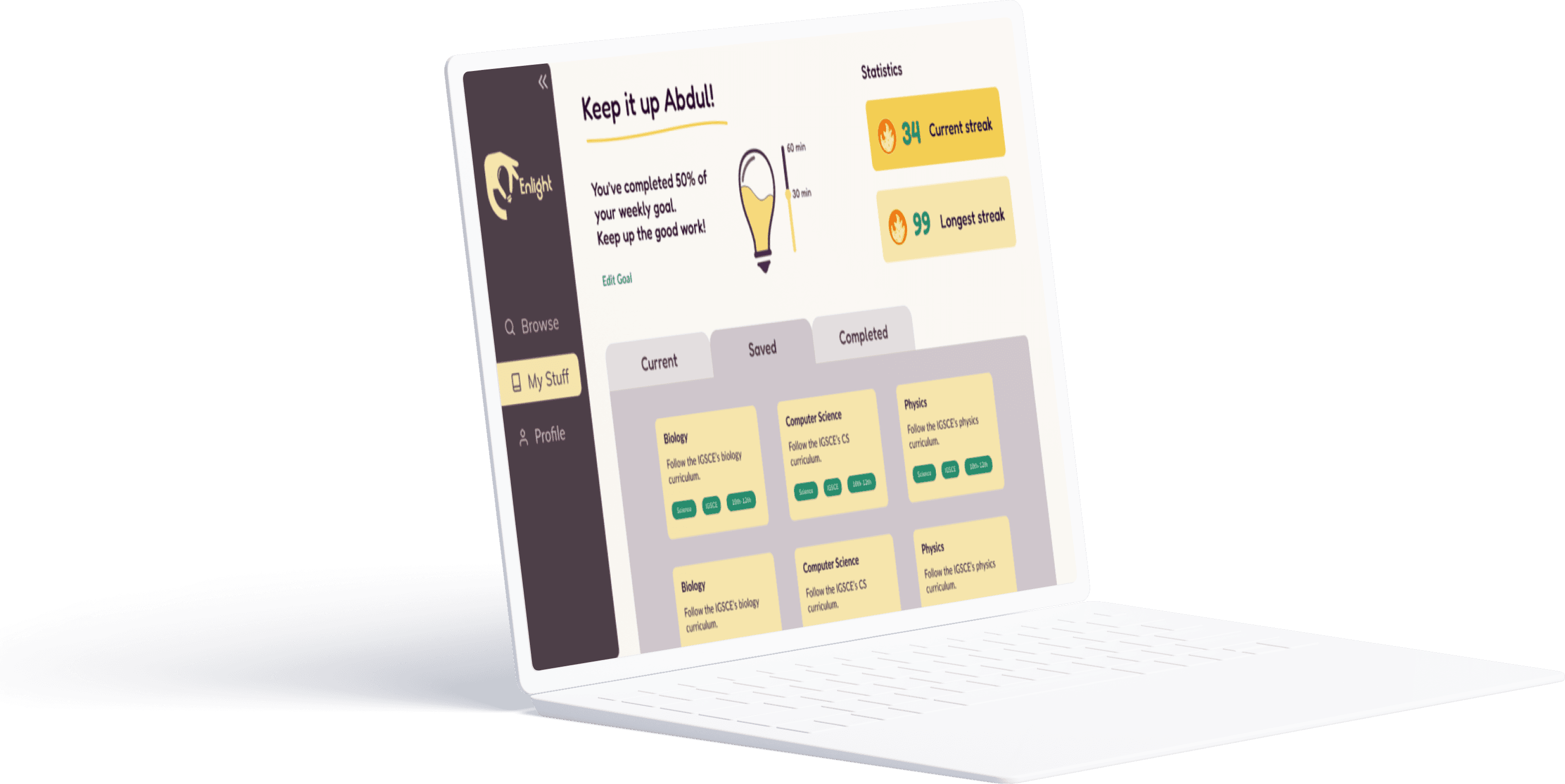
Users can navigate to the My Stuff page to check out their progress, whether it be for a specific course or their general learning journey. They can also toggle between viewing saved, current, and completed courses. Visualized progress tracking motivates users to keep learning!

Make content of your own
Educators can also use the platform and share their knowledge with students of all ages and school curricula. The simple, intuitive course-creation process allows users of all technology abilities to engage with the platform.

Time
Team
Role
Deliverable
10 Weeks
1 Project Manager
Design System
Figma Prototype
Deployed Platform
UX
Visual
4 Product Designers
5 Software Engineers
We are revolutionizing the learning experience for students across Africa by spearheading offline access to tailored educational content.
This was a project at the DALI Lab for our client, Enlight, a team of student entrepreneurs striving to make education more accessible. Upon reflecting on their educational journeys in Africa, they turned empathy into action and founded Enlight.
The partner team came to us with a physical broadcasting device and tasked us with creating its digital educational interface. As the project’s design mentor, I managed project scoping and roadmapping as well as led the UI/UX of the project.
BACKGROUND
PROBLEM
OPPORTUNITY
Students in Africa lacking reliable internet access need to reach an accessible, curated educational platform in order to feel empowered and engaged by interactive learning materials.
How might we create a holistic educational platform that feels both delightful and culturally relevant for a wide-ranging group of students in Africa?
Over 300 million students across the African continent have limited access to quality education due to the digital divide. This is because around 91% of school-aged children across the continent of Africa do not have access to reliable internet.
So, our partner came to us with 2 ideas:
The Book of Everything
A hardware broadcasting device which allows a maximum of 25 students to simultaneously connect within a 60 meter radius without needing internet access.The online platform
A multi-device platform that provides curated content aligned with local curricula, including in-depth notes, simulations, and more.

IDEATE
HMW Statements
To officially kick off our ideation phase, we crafted many “How Might We” statements and chose one that best matched our users’ needs and our goals for the project.
How might we create a holistic educational platform that feels both delightful and culturally relevant for a wide-ranging group of students in Africa?
IDEATE
Flow Sketches
With this HMW statement, our research, and the user persona in mind, we brainstormed potential design solutions, discussed key features, and sketched preliminary user flows on paper.
We restricted ourselves to 1 minute per screen in order to get as many ideas out as possible, rather than feel constrained by the worry of making the idea “good enough.”
DEFINE
User Persona
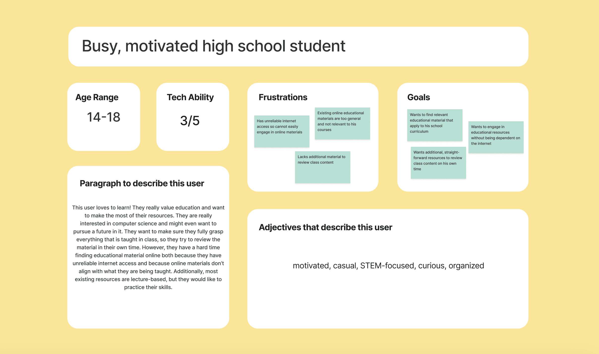
To better empathize with the intended user and build a platform that aligns with their needs, we created a user persona. This helped us ensure that we were addressing the right needs and keeping the user in mind throughout the process.
DEFINE
POV Statements
Based on our user persona, literature review, and conversations with the partner team, we crafted several point of view statements and chose the one that aligned with the project the most. This helped us narrow down what our solution’s key purposes were.
Students in Africa without internet access need a delightful learning platform in order to want to further engage in learning.
Motivated students need interactive educational content in order to continue feeling engaged and challenged by their academics.
Students following a range of academic curricula need relevant educational material in order to feel supported in their academic journey.
Students in Africa lacking reliable internet access need to reach an accessible, curated educational platform in order to feel empowered and engaged by interactive learning materials.
RESEARCH
Literature Review
We then conducted a short literature review in order to incorporate proven findings into our designs. From reading peer-reviewed articles on learning platforms, we found that...
Students’ attitudes towards using the platform do matter
Attitudes influence its perceived ease of use and usefulness
Positive attitudes lead to effective use of platform
E-learning is more effective when:
Students are immersed in the experience
E-learning focuses on supporting interaction and collaboration
Students feel cognitively engaged by the content
People’s attention to e-learning platforms is influenced…
Mainly by color, text, and typography
Secondarily by layout
Effective colors and text can effectively enhance students’ visual attention and retention of information
PROTOTYPE
Low Fidelity Wireframes
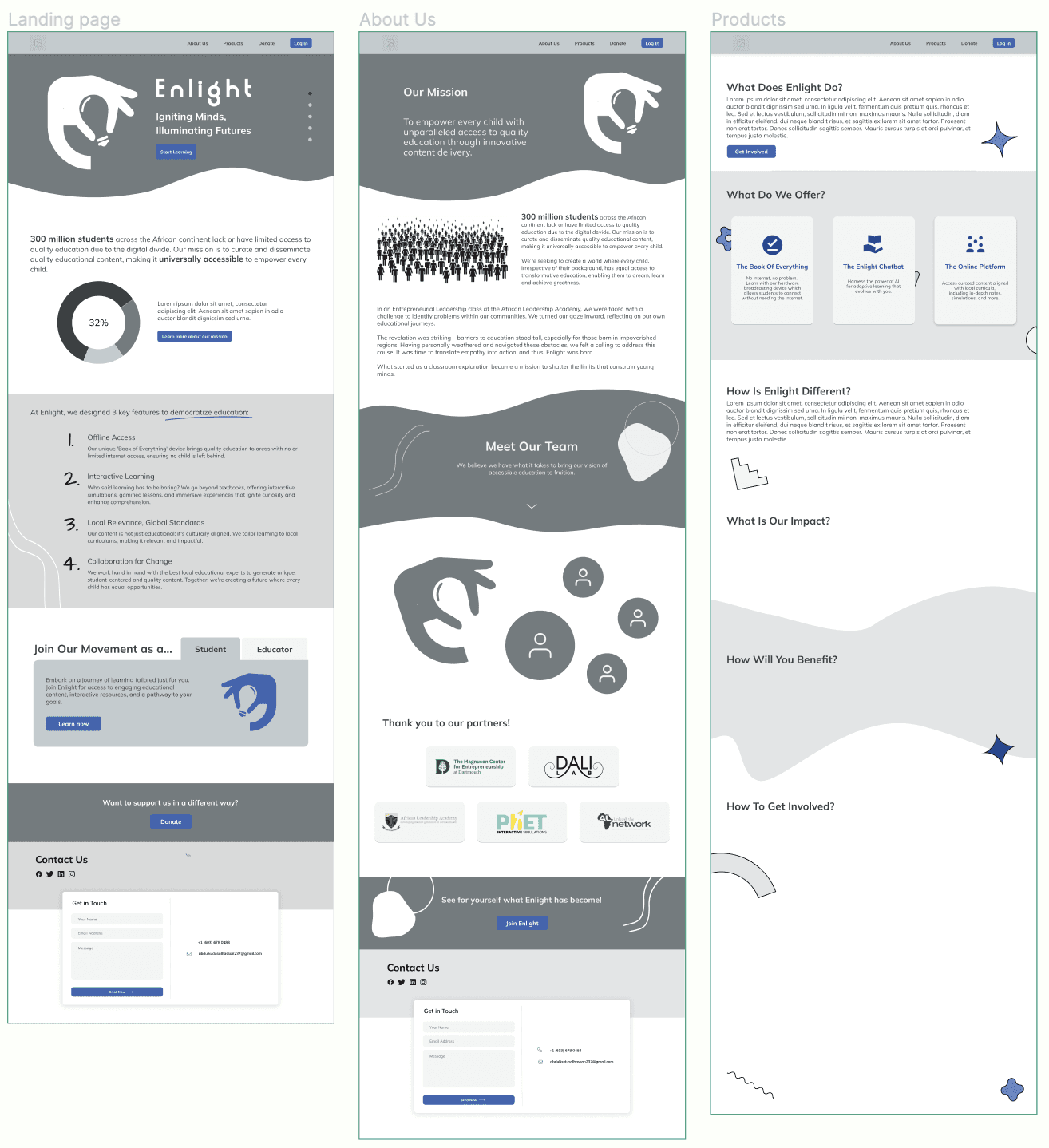
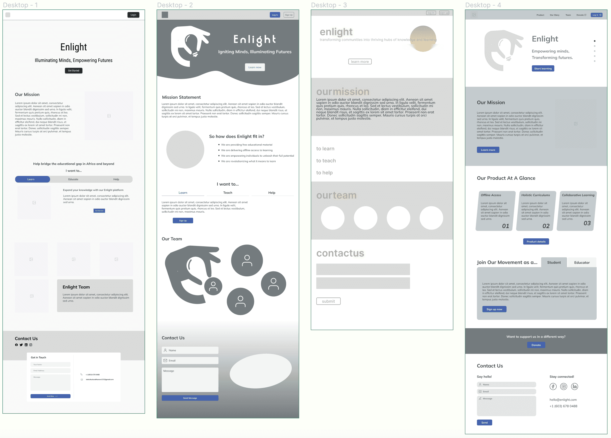
From these sketches, we quickly created some low fidelity wireframes, incorporating elements from our industry analysis and HMW statements.
We then discussed our favorite elements from each of these iterations and consolidated the design elements and content type to create three main pages.
PROTOTYPE
High Fidelity Prototype
Before finalizing our style guide, we played around with the colors of the landing side. We wanted to emulate a playful but educational color palette that appealed to a range of student types.
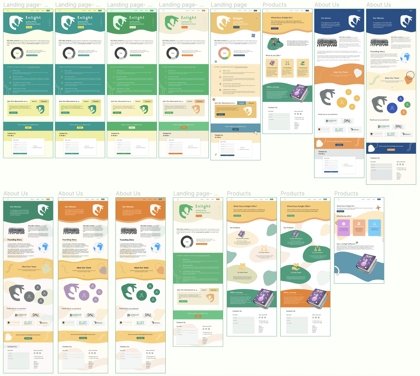
Check out the full landing site!
PROTOTYPE
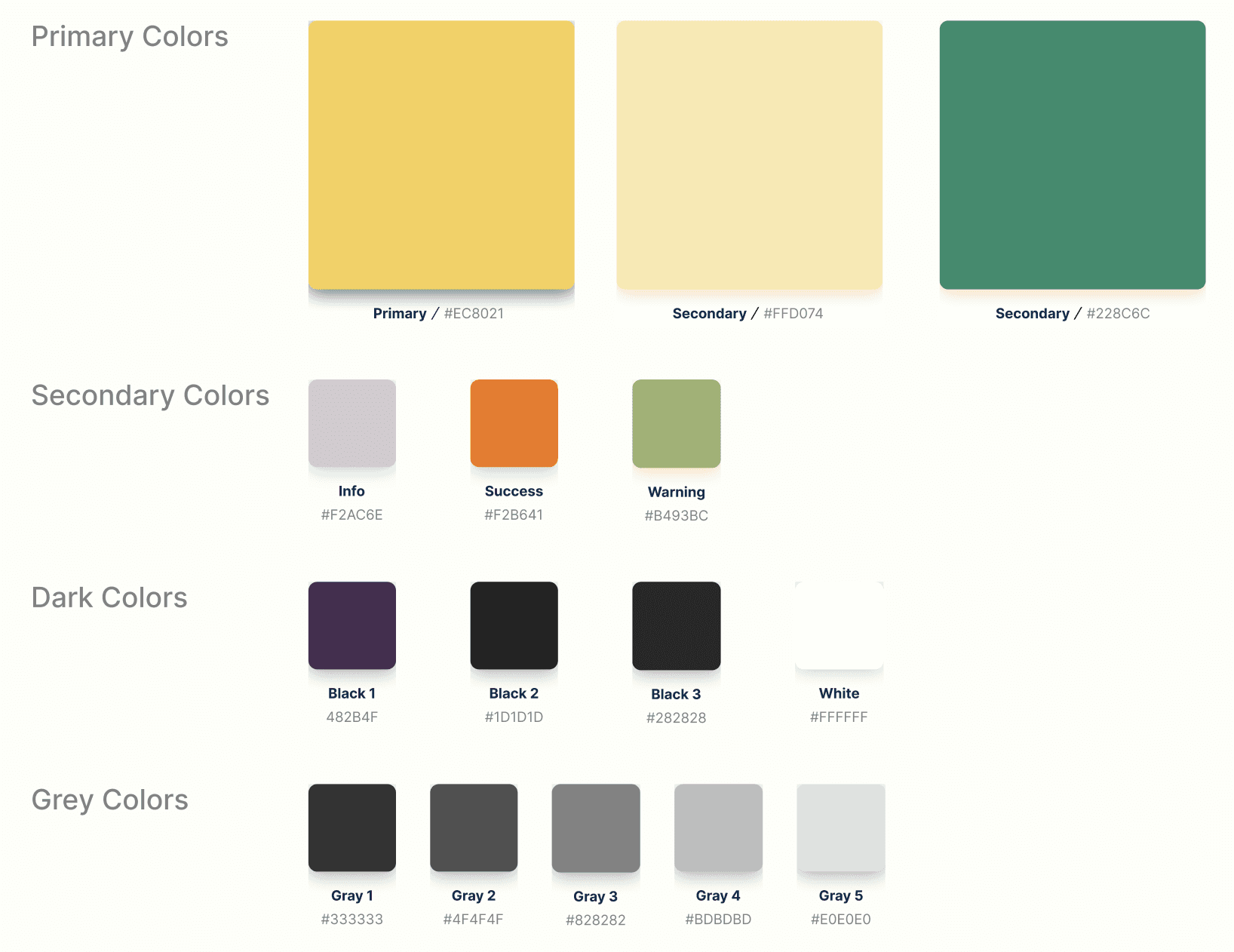
Visual Design System
We went over our favorite color iterations and solidified the color palette and design components. We added some additional content to the landing page screens and applied the chosen colors.

PROTOTYPE
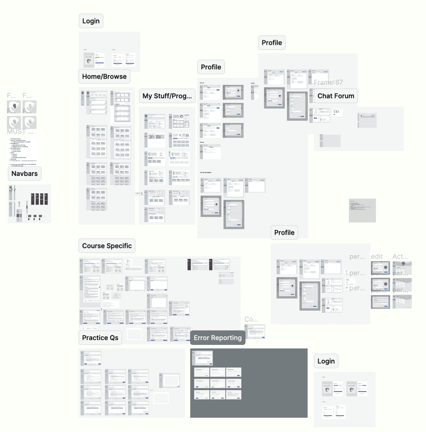
Low Fidelity Wireframes
We then created some low fidelity wireframes, keeping in mind the key features we had just discussed.
We broke up the learning platform into several parts:
The Browse Page
To explore different course offerings through personalized recommendations and searchingThe My Stuff Page
To view saved and current courses and to keep track of progressThe Profile Page
To add personal details and change settingsThe Course Page
To display each course’s units, with corresponding pages to their content and other educational materialThe Issue Reporting Section
To allow users to report
PROTOTYPE
Visual Design System
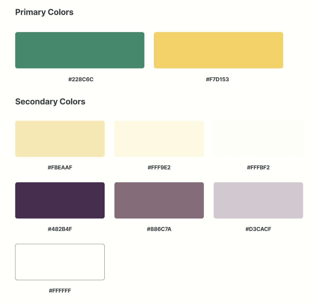
We wanted to maintain similar colors between the landing site and the learning platform. At the same time, we needed to add and edit some of the colors to make the platform look more cohesive and color accessible. So, we created a new color style guide, along with text styles and components for buttons and the navigation menu.
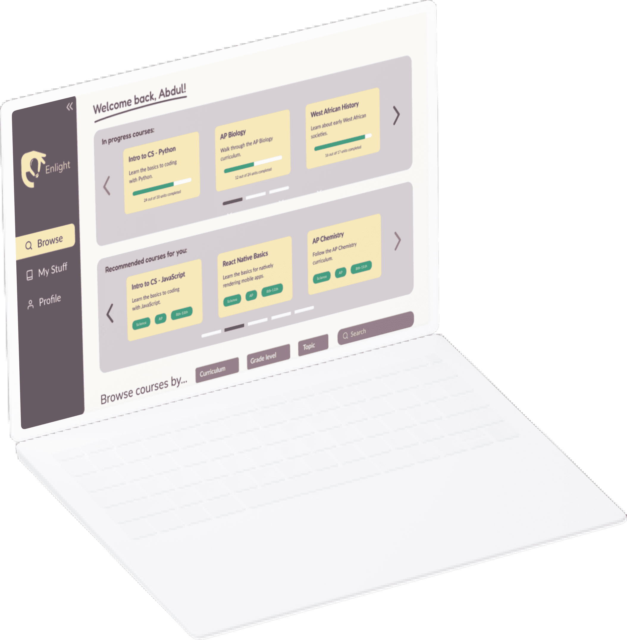
Browse courses specifically chosen for you based on your interests and activity
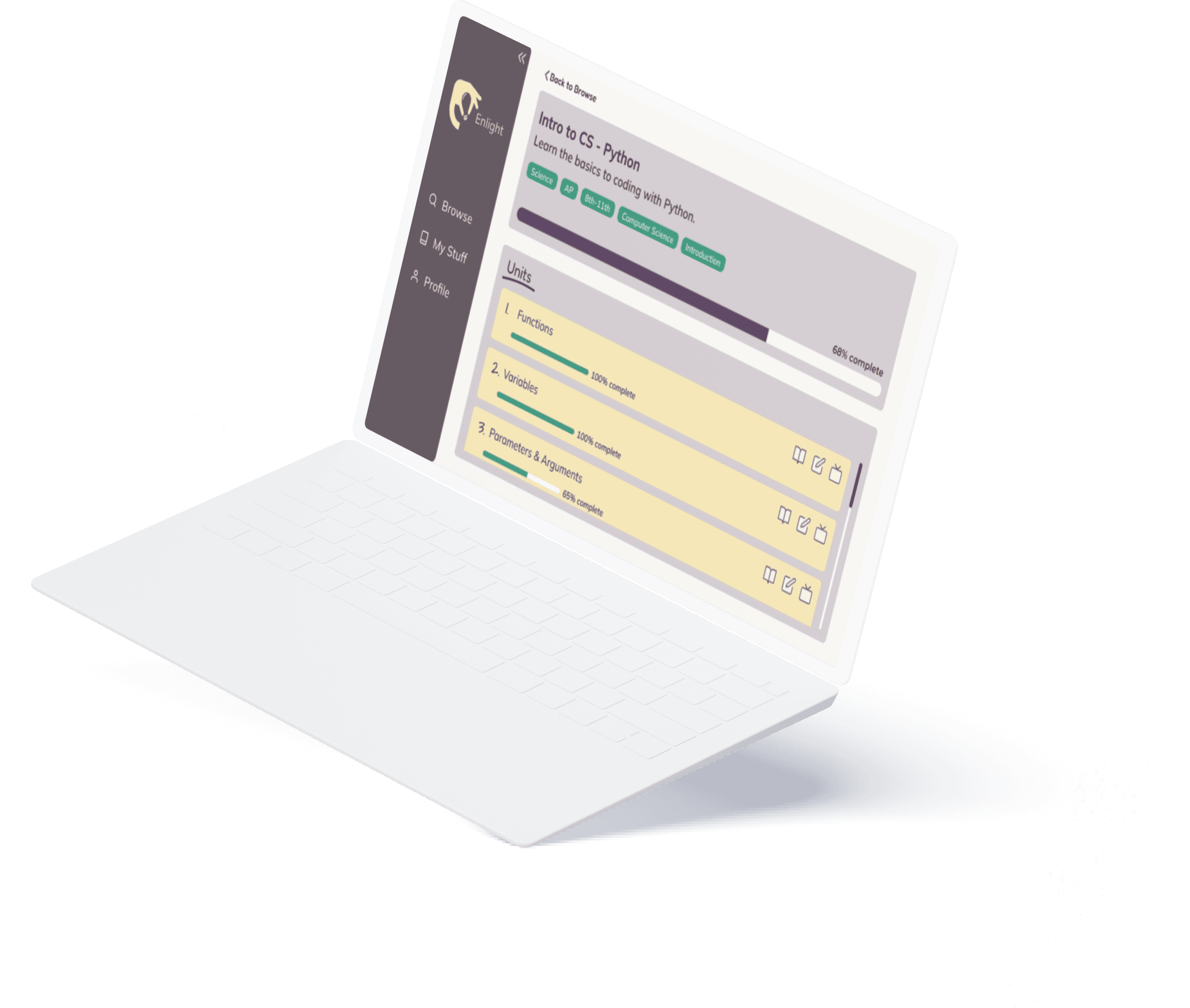
View each course’s structure in one organized snapshot
Track your progress and all of your saved, current, and completed courses
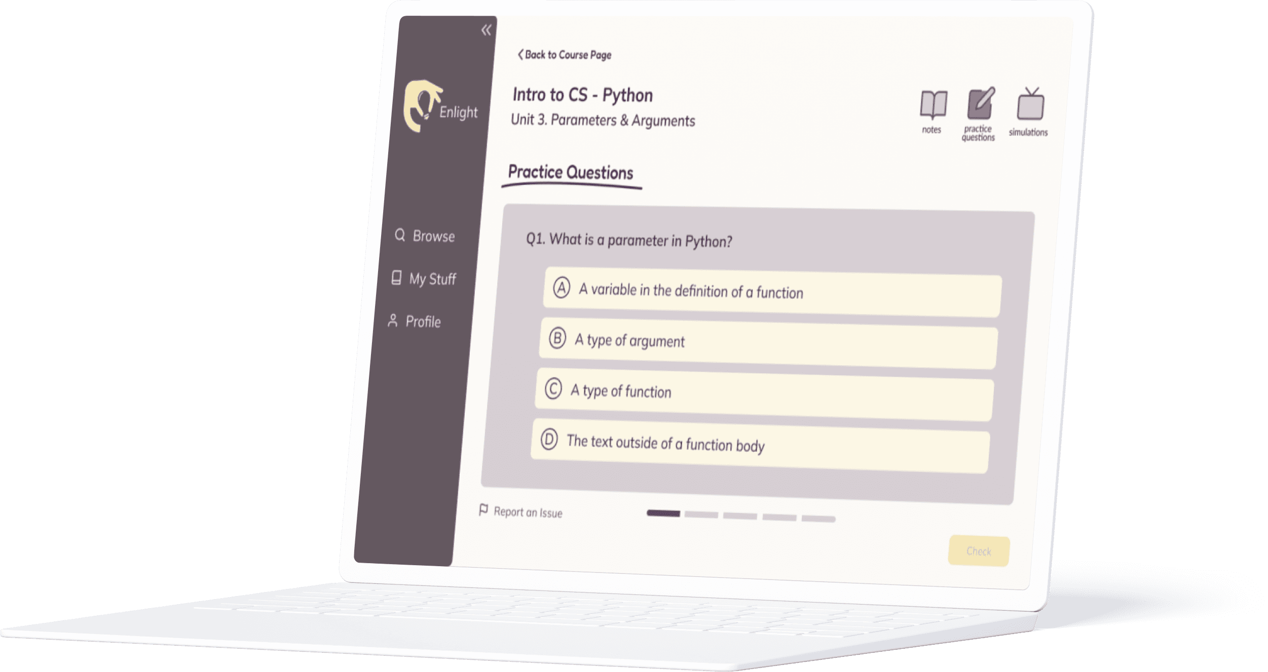
Test your knowledge with activities such as practice questions and simulations
PROTOTYPE
High Fidelity Prototype
We finalized our grayscales, implemented the colors and text styles, and turned our lo-fis into hi-fis.
IDEATE
Flow Sketches
Having completed the landing site, we started tackling the student-facing learning platform. We drew inspiration from our industry research and created some quick flow sketches to get us started.
IDEATE
Feature Prioritization
High impact
Low impact
High effort
Low effort
browsing courses
view course details
take notes
watch videos
save courses for later
track progress
practice questions
view/edit profile
report issues
chat forum
simulations
We brainstormed features by going over our research and our flow sketches, and then we used an impact/effort matrix to decide on which features to prioritize.
RESEARCH
Industry Research
And finally, we created the educator-facing platform. While the learning platform was being developed and deployed, we conducted industry research for the creator platform.
Some of the platforms we analyzed were:
Kahoot
Canvas
Bloomz
Talent Ims
Udemy
IDEATE
Flow Sketches
Using inspiration from these platforms, we sketched some user flows onto paper.
Some of the key features we identified were:
Creating, editing, and publishing courses
Creating and populating units
Creating practice questions
Uploading simulations
Viewing and resolving issue reports
PROTOTYPE
High Fidelity Prototype
Since we had already established a visual design system and navigation system for the general Enlight platform, we went straight into designing high fidelity prototypes for the educator-facing platform.

Create courses
Create courses for all different subjects, curricula, and student types. You can either publish the course or keep it private while you keep working on it.

Create and populate units
Break down each course by creating units. Within each unit, add all types of media and text to explain the topic in-depth.

Add interactive learning components
To deepen students’ knowledge and test their comprehension. add simulations and practice problems to each unit.

Resolve issues
View all reported issues with your courses in the profile section. Easily find and resolve them by going to the page where the issue occurred.
TEST
Usability Testing
After finishing the design sprint (designing three different platforms in nine weeks), we conducted usability testing. At a showcase for innovative tech products, we presented our designs to graduate and undergraduate Dartmouth students and faculty. We asked them to engage with the platforms as though they were trying to learn a new subject. We provided them with specific tasks to complete as well as asked for their general opinion on the user interface and experience.
Some tasks included:
Explore the landing site
Find what makes Enlight different than most educational platforms
Explain how the founders’ journey informed the product
Explore the learning platform
Filter and find an AP science course
Find the computer science course you are currently taking
Complete some practice questions for the computer science course
Report an issue with a simulation
Edit your education level in the profile section
Explore the creator platform
Create a course
Create a unit
Embed a video in a unit
Create a fill-in-the-blank question
Create and delete a simulation
Resolve a reported issue
TEST
Revisions
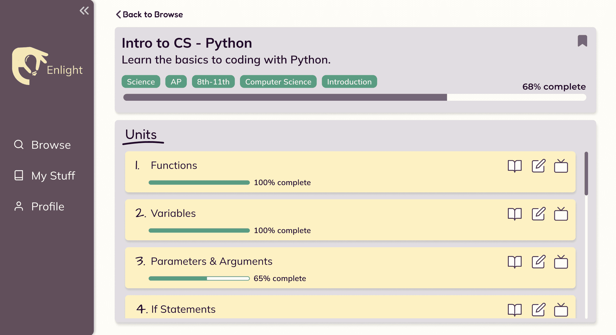
Based on user feedback, we revised our work and implemented three key changes.
Adding hierarchy to the units
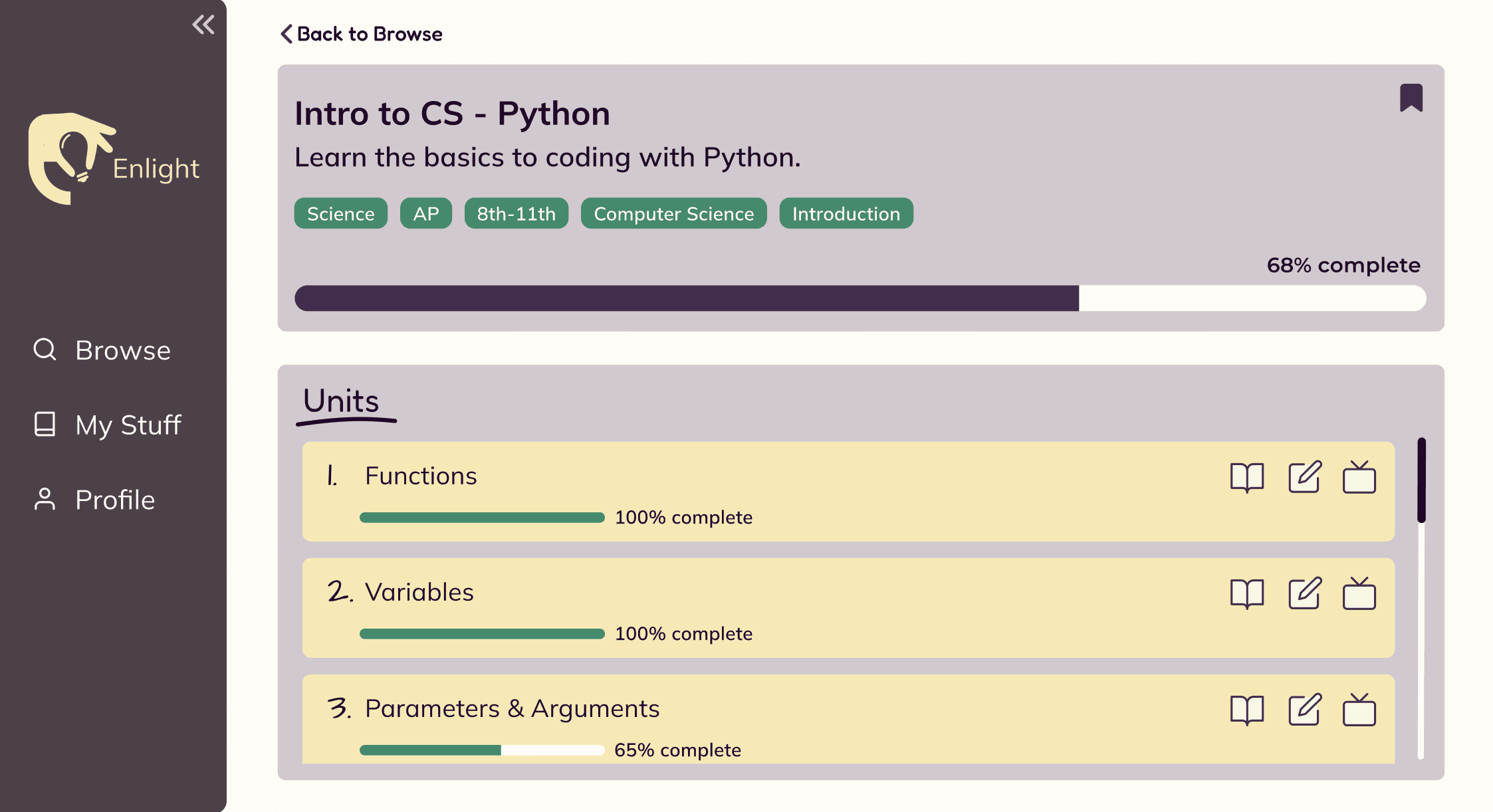
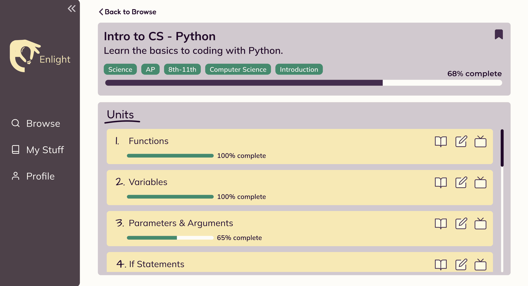
When looking at a course page, users found that there was too little emphasis on the units. Even though they liked how the course title and description looked, they wanted more focus on the units because the main reason for going on the course page is to access a unit. To address this, we decreased the size of the course title header and increased the section for units.
Labeling icons
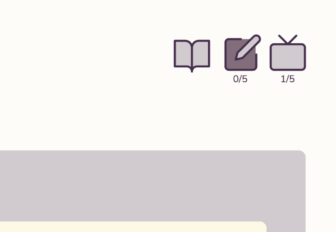
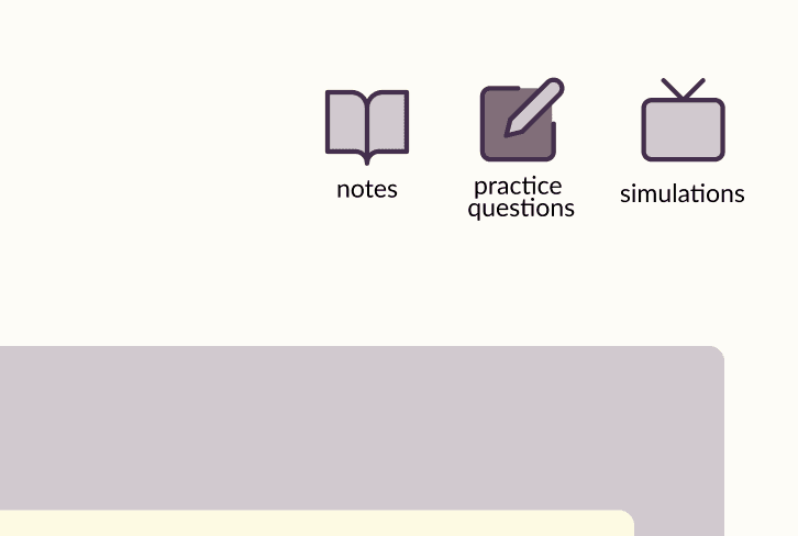
Every unit page has three key actions: taking notes, doing practice questions, and engaging in simulations. However, the icons for these actions were confusing for users — they were not sure what they meant or what would occur if they clicked on them. We tried to relieve this confusion by spacing them out more and adding labels.
Decreasing color hierarchy
We wanted the platform to be warm and bright in order to excite users and compel them to use it. But, during our user testing, some users expressed concern about how many colors each screen had and how saturated these colors were. To make sure we weren’t overwhelming the users with these colors and adding unnecessary hierarchy to each screen, we decreased the saturation of most colors.

REFLECT
Next Steps
Our project was created to revolutionize access to education by providing a free learning platform that isn’t dependent on the internet. Our clients were excited about our designs and we look forward to seeing how they will be fully deployed and used by all types of users!
In continuing this project, we would add more progress-tracking and organizational features to help students visualize their efforts and feel more motivated to keep learning.
First, we would add weekly challenges.
These would range from spending a certain amount of time doing simulations, to completing a certain amount of units or answering a certain amount of practice questions correctly. The goal of these challenges would be to use gamification to motivate students to explore new subjects and hone their skills.Second, we would play around with content organization.
Other than wanting more emphasis on the units, users also felt that the platform seemed a little overwhelming. During user testing, they mentioned wanting some of the elements to be more spaced out, such as the cards for each course on the browse page. We would continue conducting user testing while iterating with the sizing and hierarchy of different elements.Third, we would iterate further with color.
Although we like the playful colors of the platform, we don’t want them to detract from the educational content. We want a color palette that appeals to both younger and more mature users while also meeting web accessibility guidelines. So, we would keep playing around with color saturation, brightness, and opacity but maintain the core Enlight colors purple, green, and yellow.
REFLECT
Key Takeaways
This was one of my first projects working with so many roles and my first project as a design mentor and it was such a rewarding experience!
Having a big team was challenging in positive way. I got better at designing with technological constraints, project scoping and delegating to the other designers, and communicating clear user flows and features during development.
I look forward to further strengthening these design, cooperation, and partner relation skills in future projects!
thanks for reading
check out more projects
display high-level information about each course
able to sort and filter available courses
organize each course into chapters/units
save courses for later
promote learning in the moment (rather than multi-tasking)
visualize progress tracking
celebrate learning accomplishments
left-hand navigation menu
And came up with a list of desired features: